
Floof Brand Identity
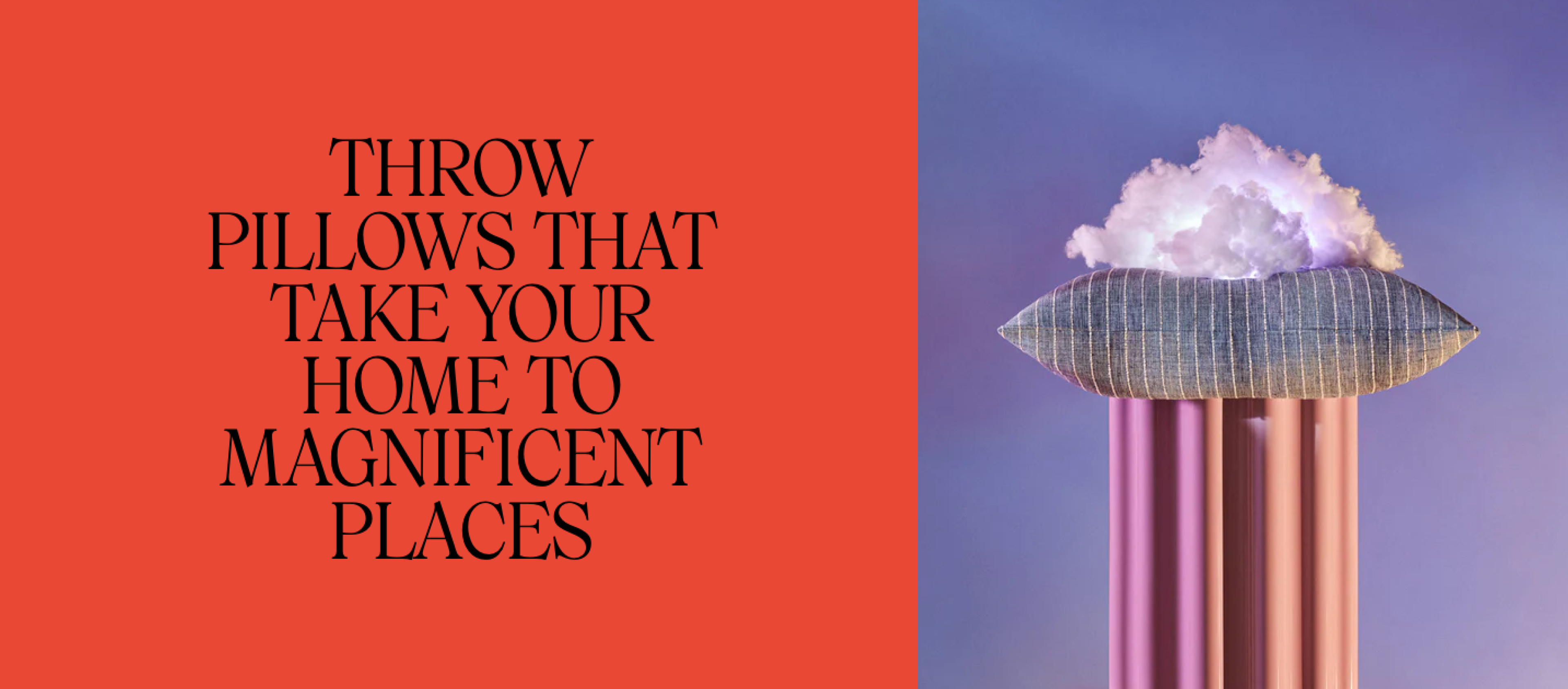
The home design company that
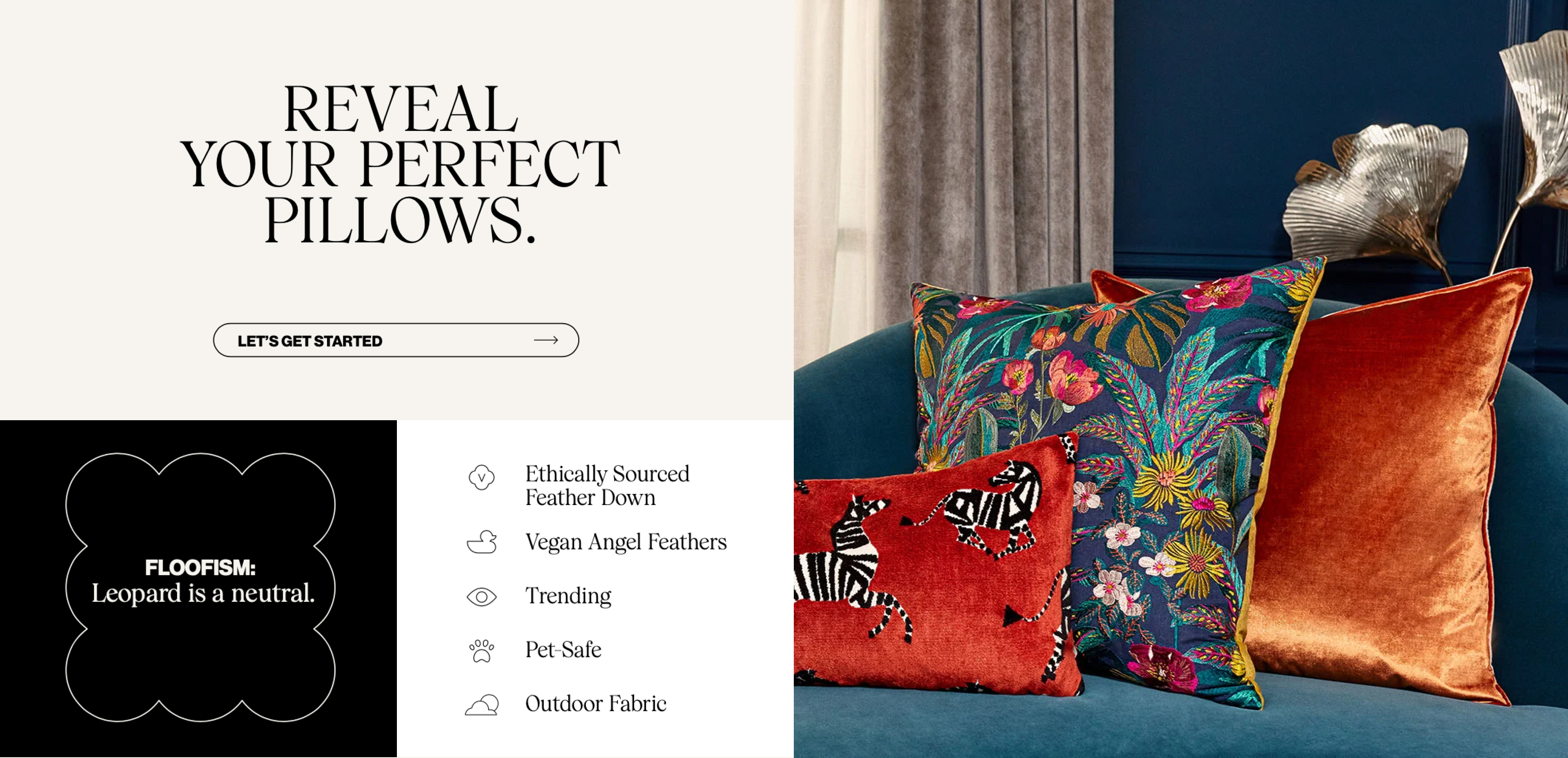
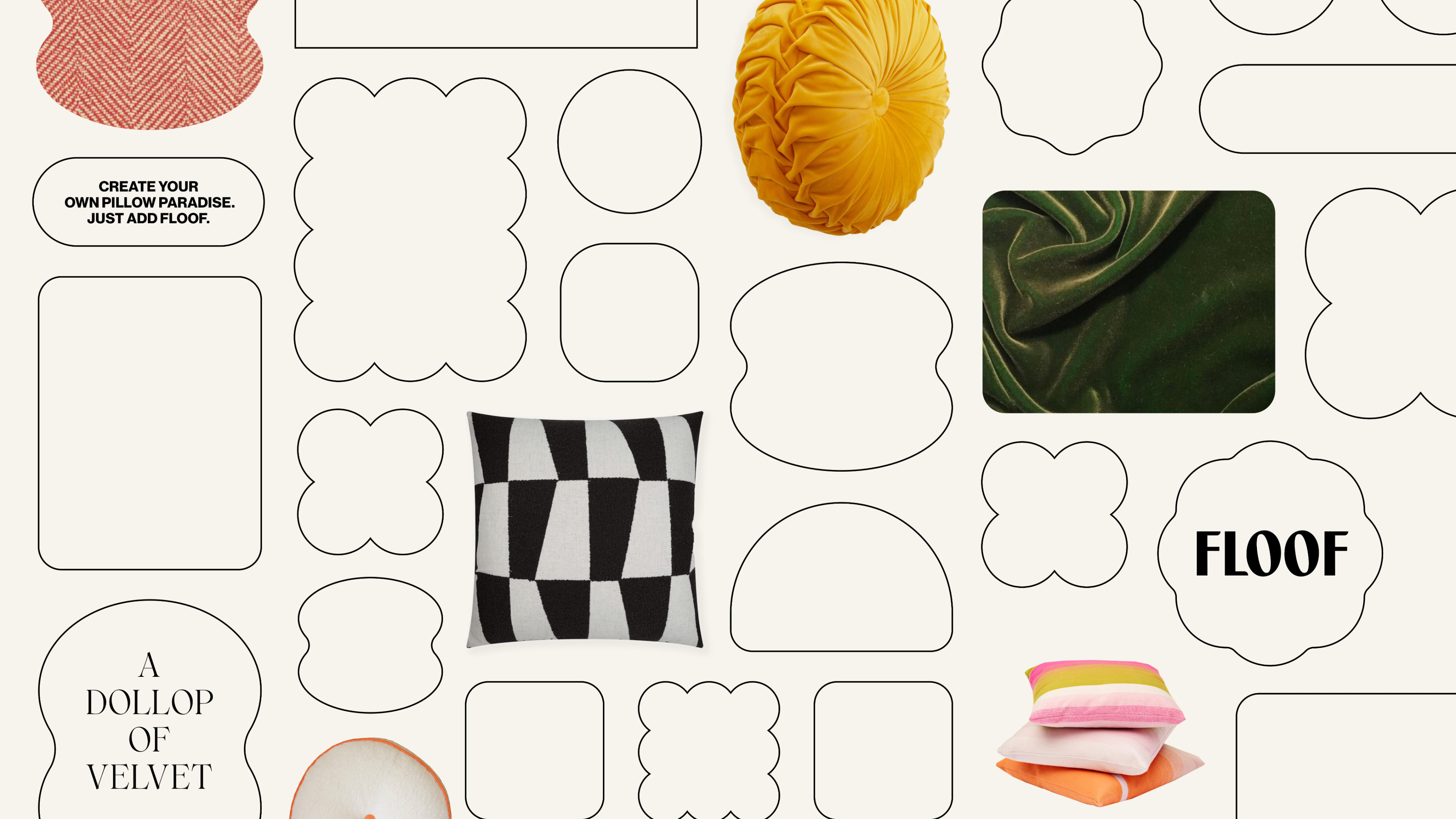
joyfully guides you to the perfect pillows
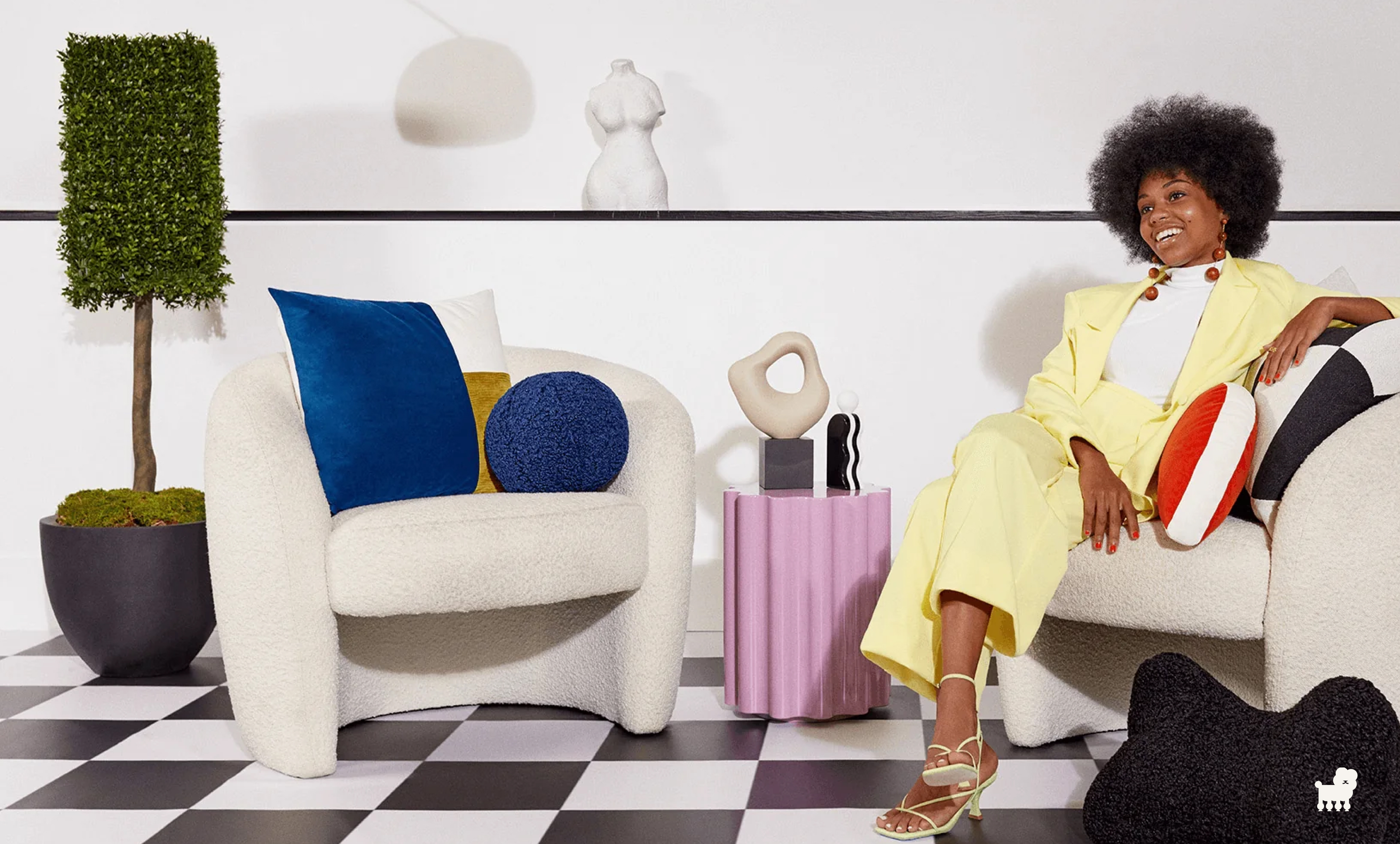
to lift your space and your spirits. We aim to present comfort in the context of quality and style.
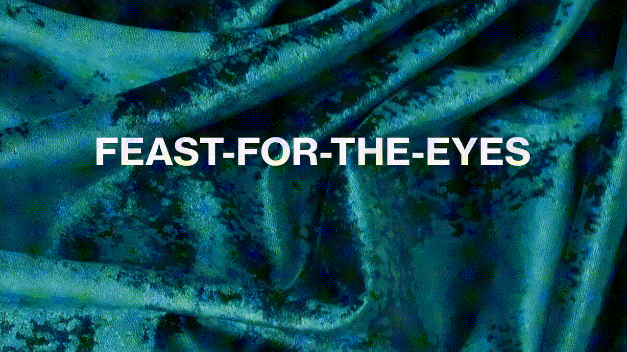
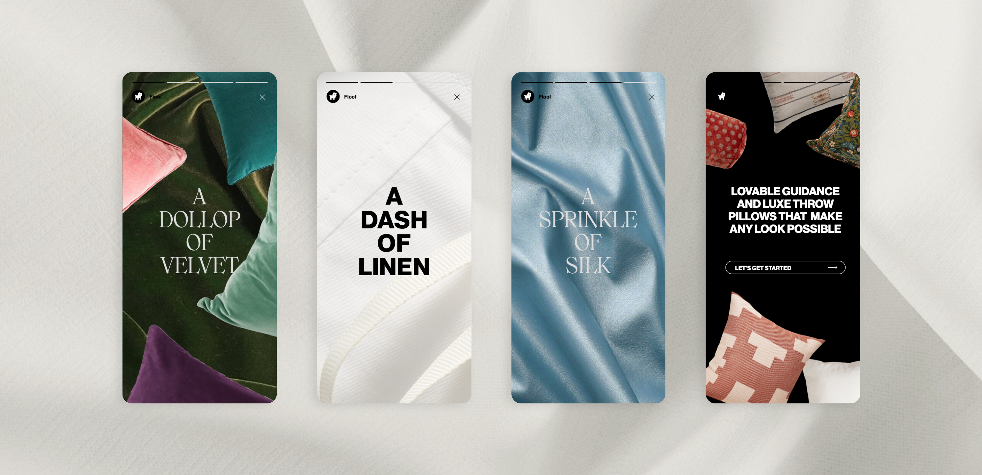
The floof world has been created around the brand idea of making wonderland real. We want to show people that pillows are so much more than
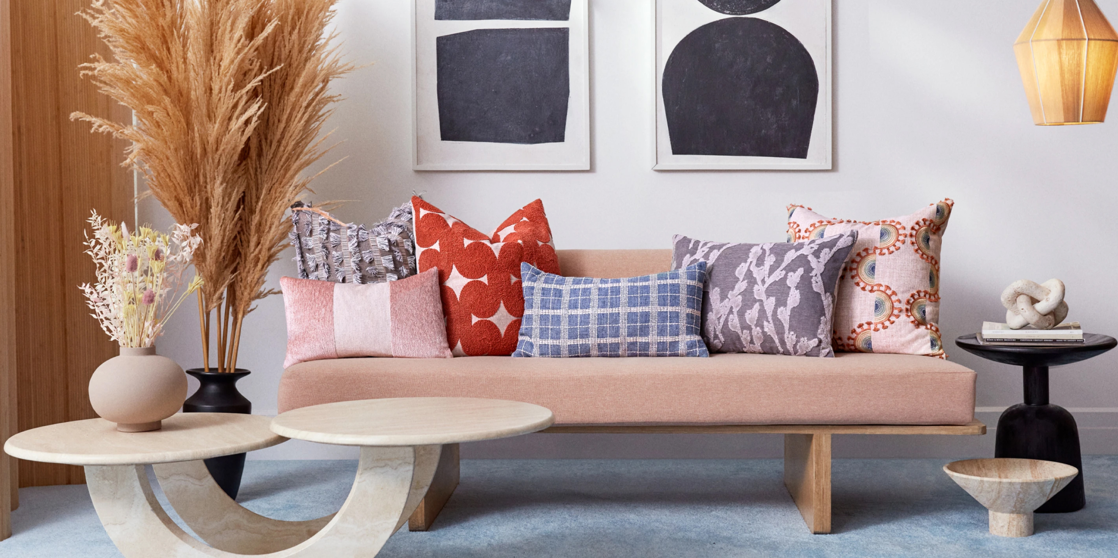
décor by highlighting their power to transform,
refresh, and polish.

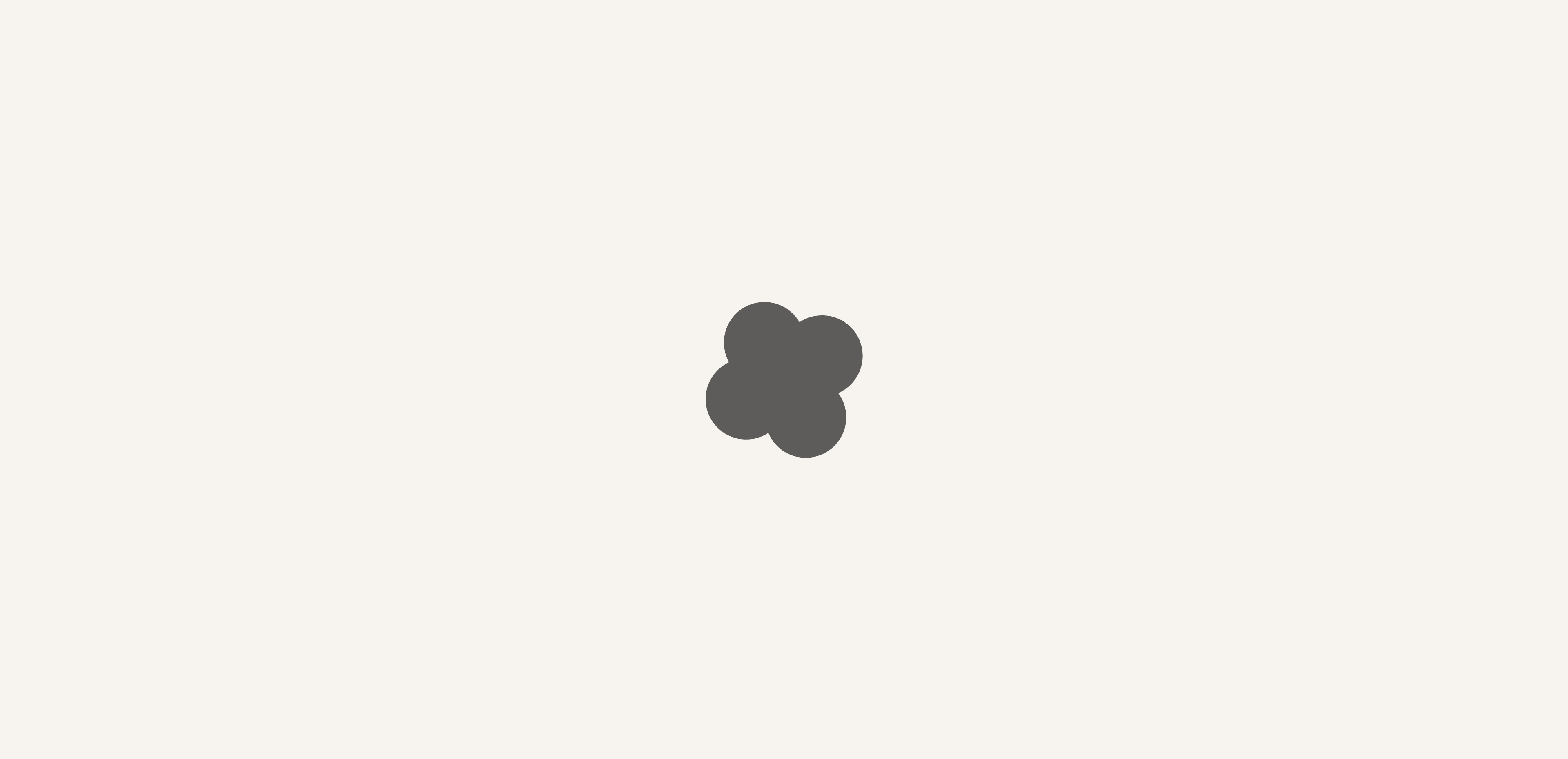
The idea of a magical creature that embodied ‘floof’ was something we wanted to explore. Inspired by the quality of the product I created this graphic soft cushionlike shape that served as a base for the poodle inspired creature. Throughout the process we also explored it’s features, stance and continued onto refining it until reaching our final brand symbol.


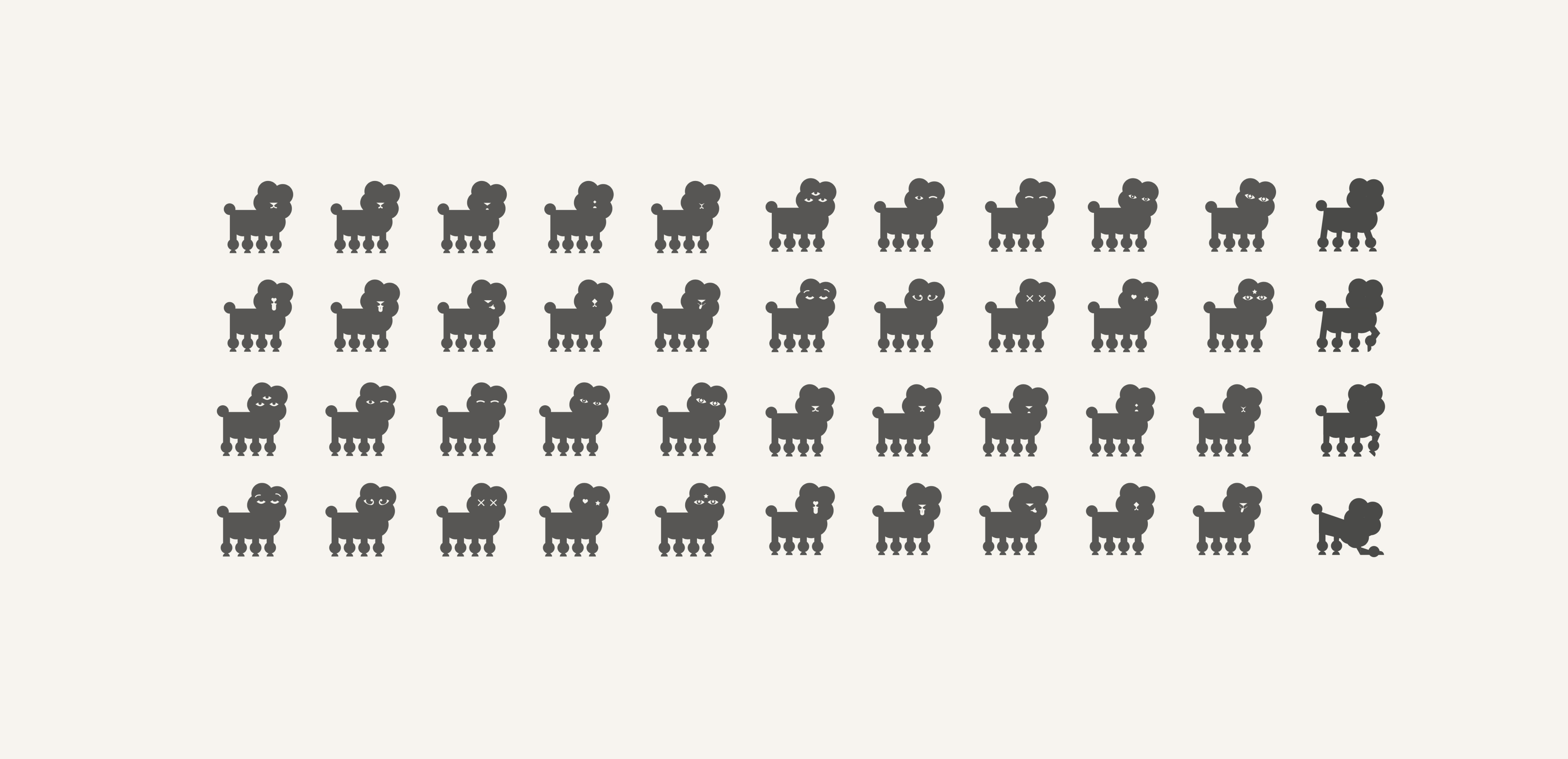
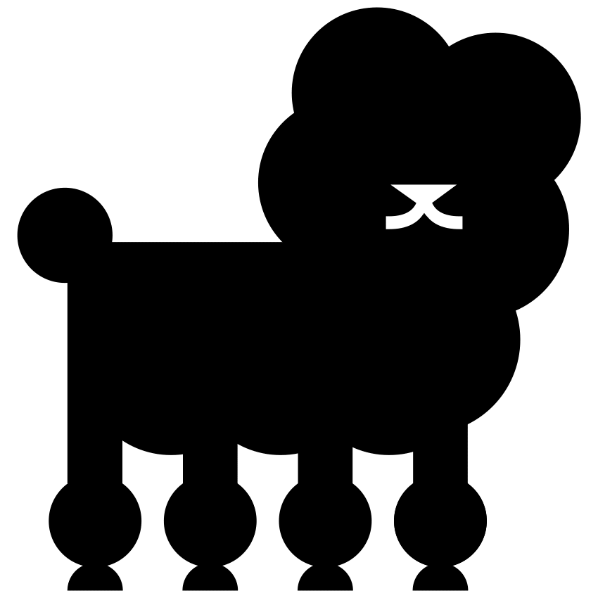
Meet our poodle, our brand symbol that acts as a secondary mark for
the brand. It provides an element of playful brand expression, while visually connecting the elegance of our wordmark to the plush
comfort of our product. Sophistication and softness are captured in the round geometric curves and streamlined forms, while a hint of the poodle’s nose and mouth provide a bit of charming personality, ensuring our brand is always inviting and approachable.
It also behaves as the embodiment of guidance, appearing to offer inspiration and expertise, and letting people know they’re supported every step of the way.
It also behaves as the embodiment of guidance, appearing to offer inspiration and expertise, and letting people know they’re supported every step of the way.

Credits:
Client:
Floof
Agency:
Red Antler
Executive Creative Director:
Jenna Navitsky, Erin Collis
Design Director:
Sarah Schiesser
Designers:
Bex Zank, Jenn Flores
Interactive Designer
Kaily Gillan
Implementation:
Avex Design