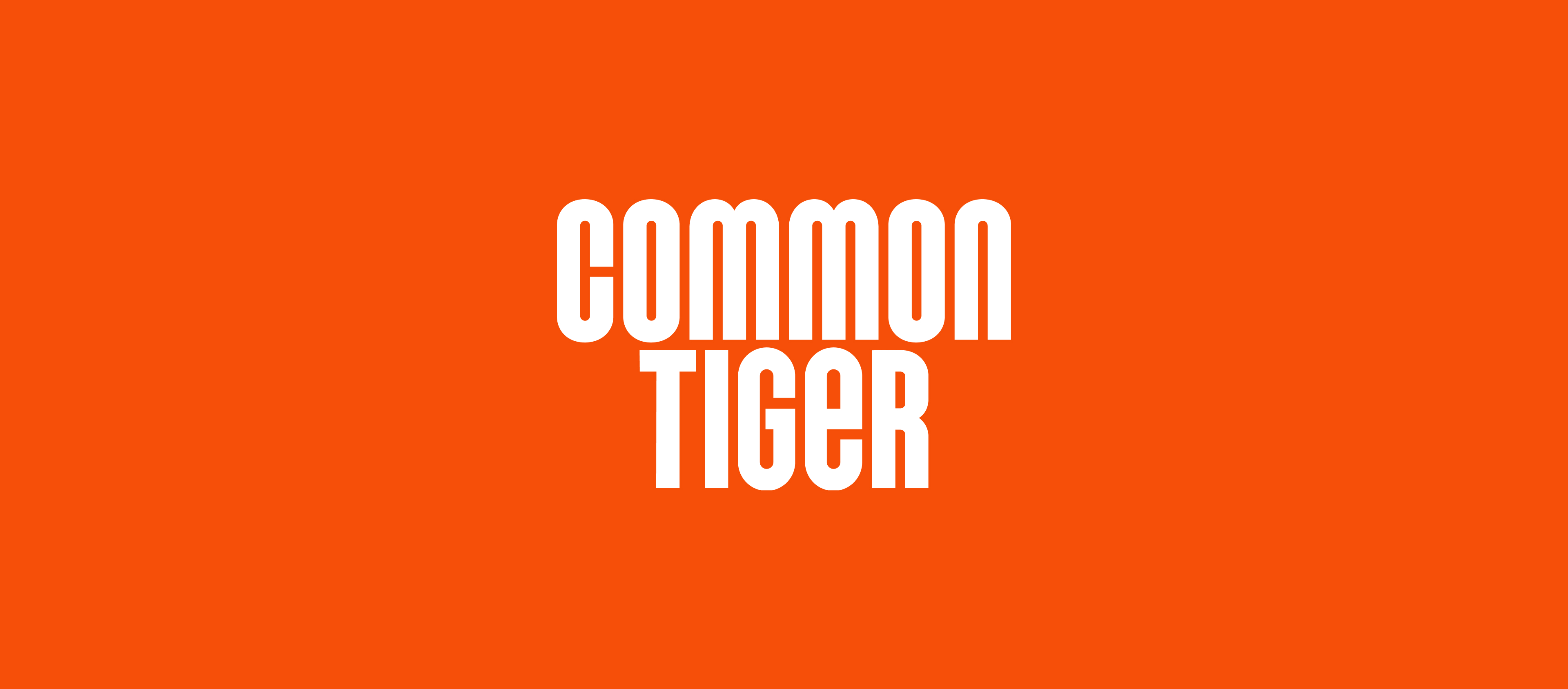
Common Tiger
Brand Identity
The outdoors has a special way of connecting you to your fullest self. But you can’t tap into all that you are if you can’t make outside spaces feel like your own.
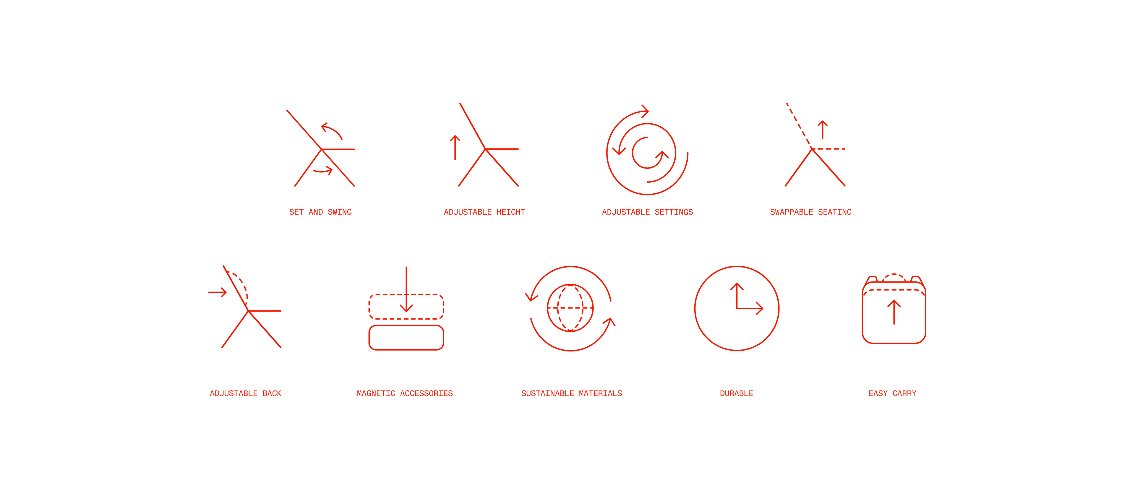
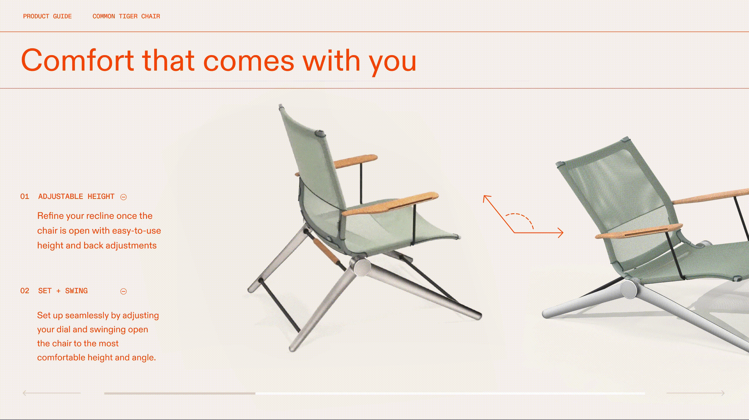
With iconic designs that reflect your style and adjustable features
for comfort and ease, our chairs help you unlock your full self.
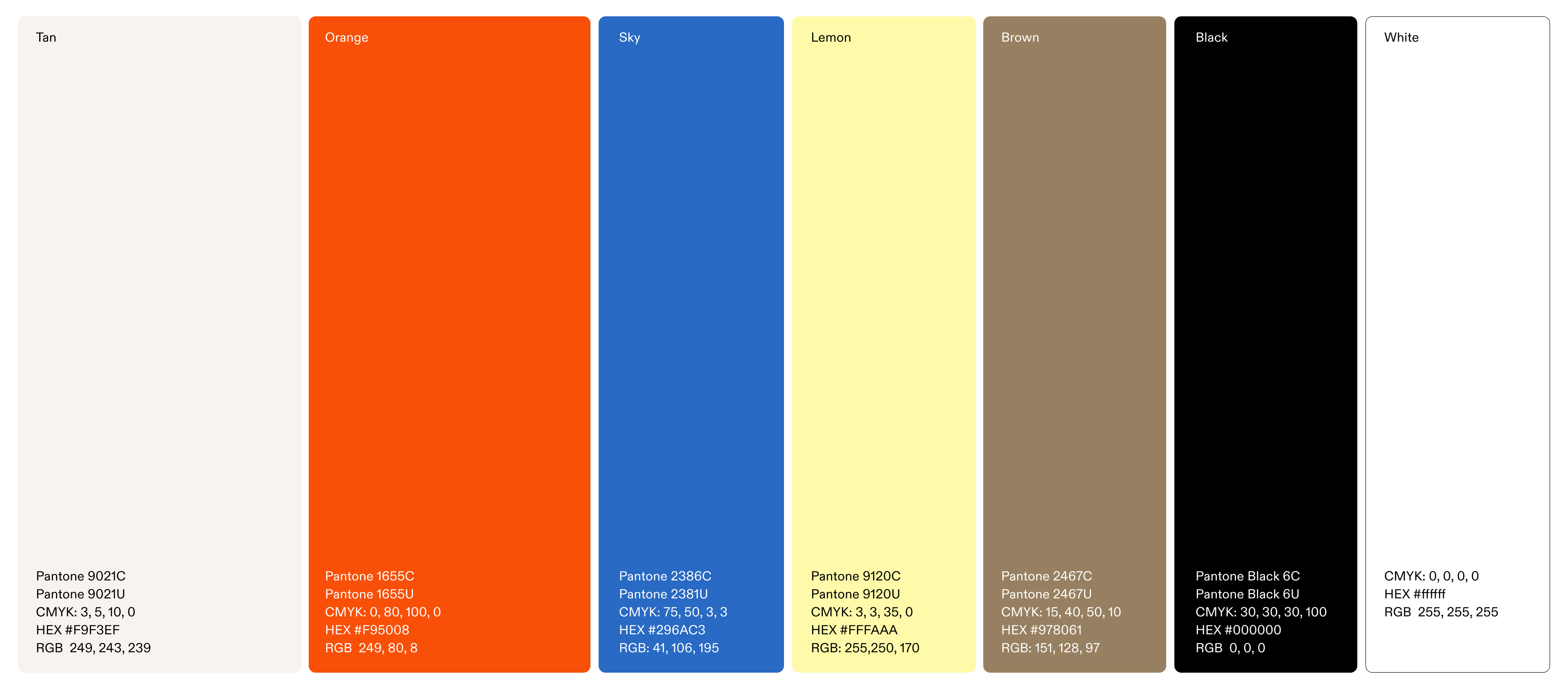
We drew inspiration from geographic coordinates to convey a sense of space. Our labels/tags device is intentionally organized to highlight the brand's joy and expressive pillars. The overarching goal is to celebrate the essence of the outdoors and emphasize its ability to open up new mental horizons. Our chair offers the comfort and freedom to be your authentic self wherever you are.
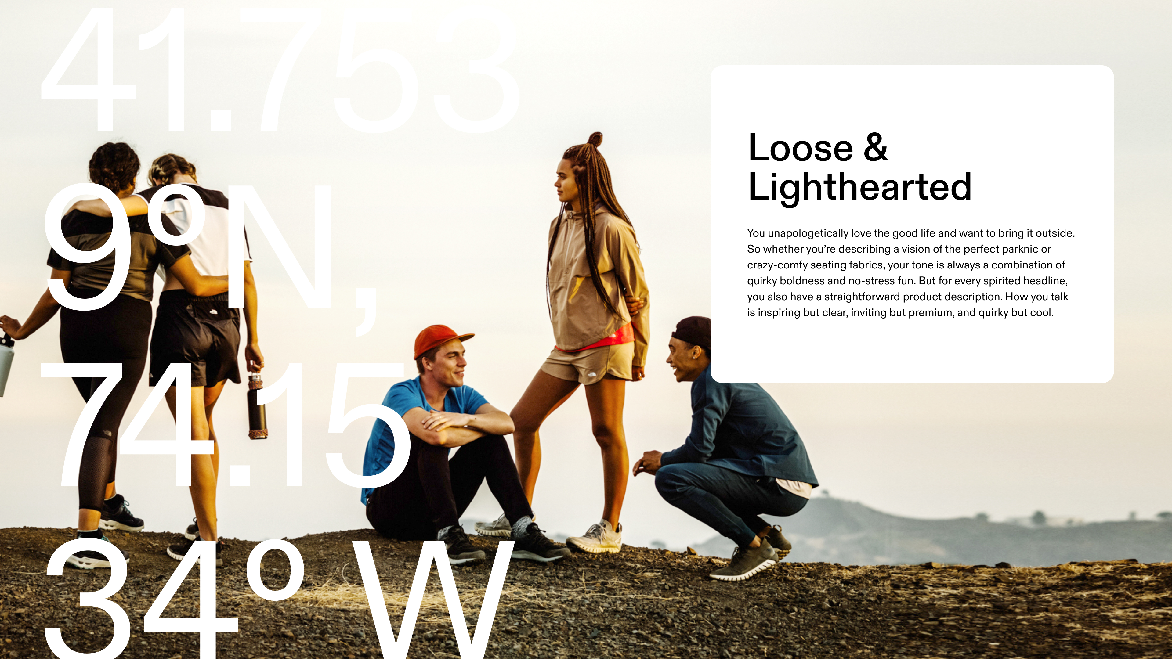

Our symbol is based on our name, but also reflects our brand's spirit of movement and spontaneity. The mark is incredibly unique, with custom lettering, photographic textures, and an orange, off-centered silhouette creatively layered together.


Credits:
Client:
Common Tiger
Agency:
Red Antler
Executive Creative Director:
Jenna Navitsky
Creative Director:
Dan Crawford
Designers:
Jenn Flores, Claire Smight

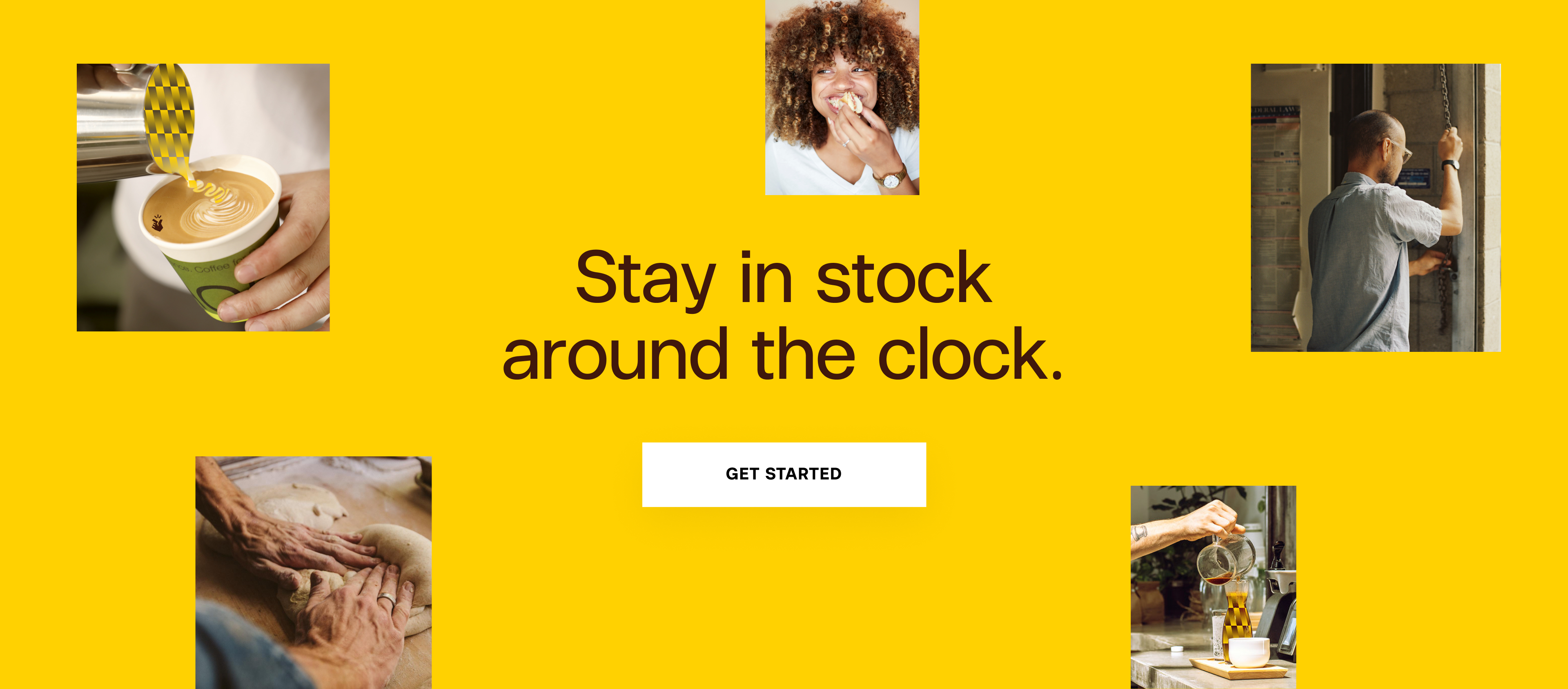
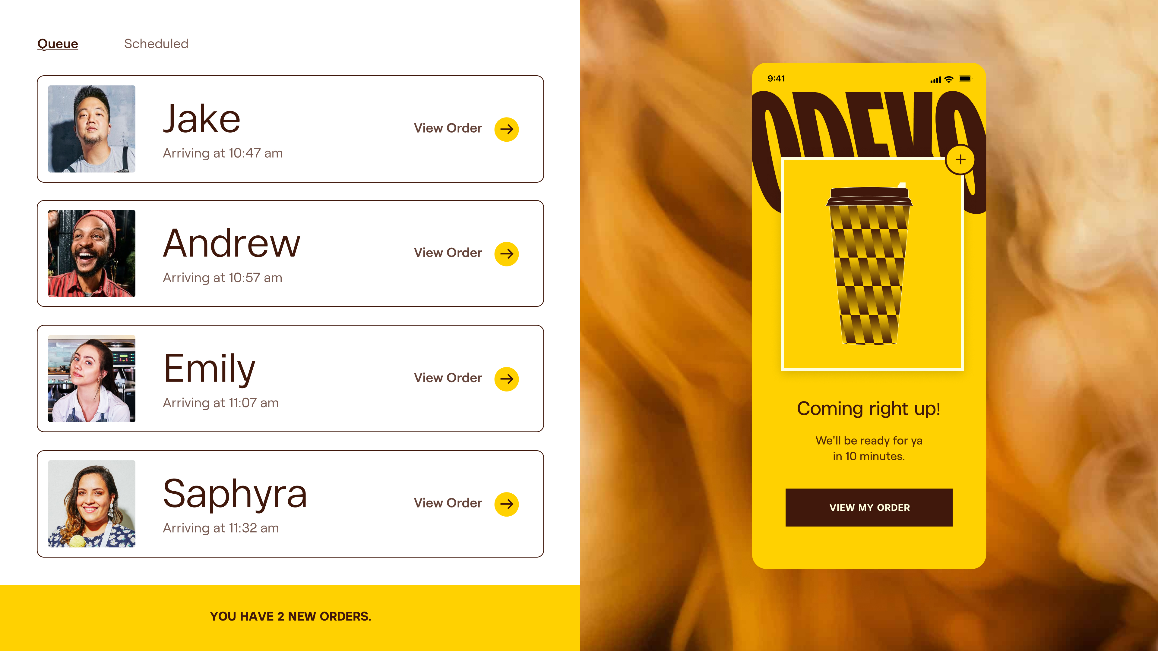
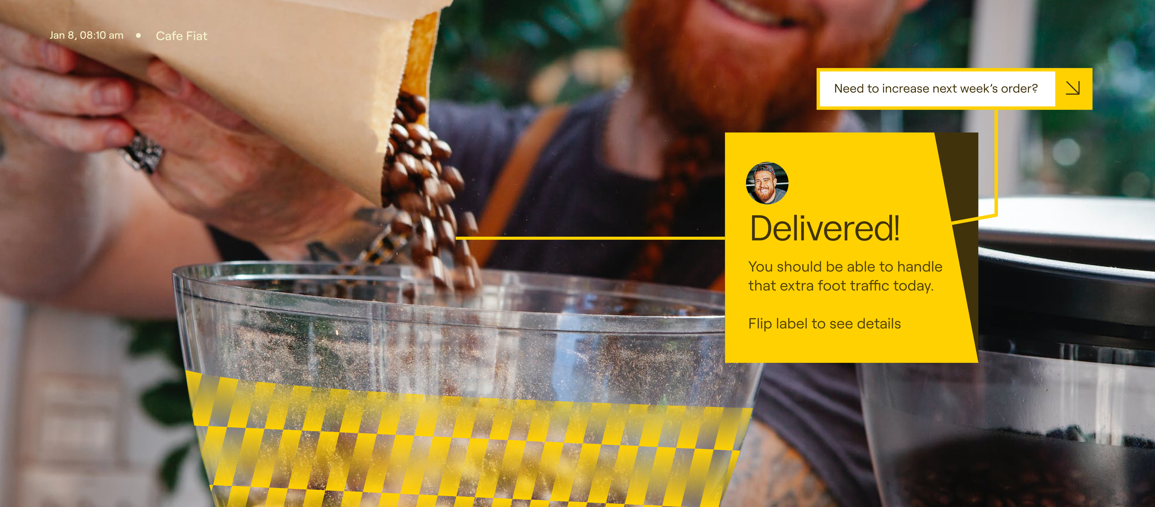
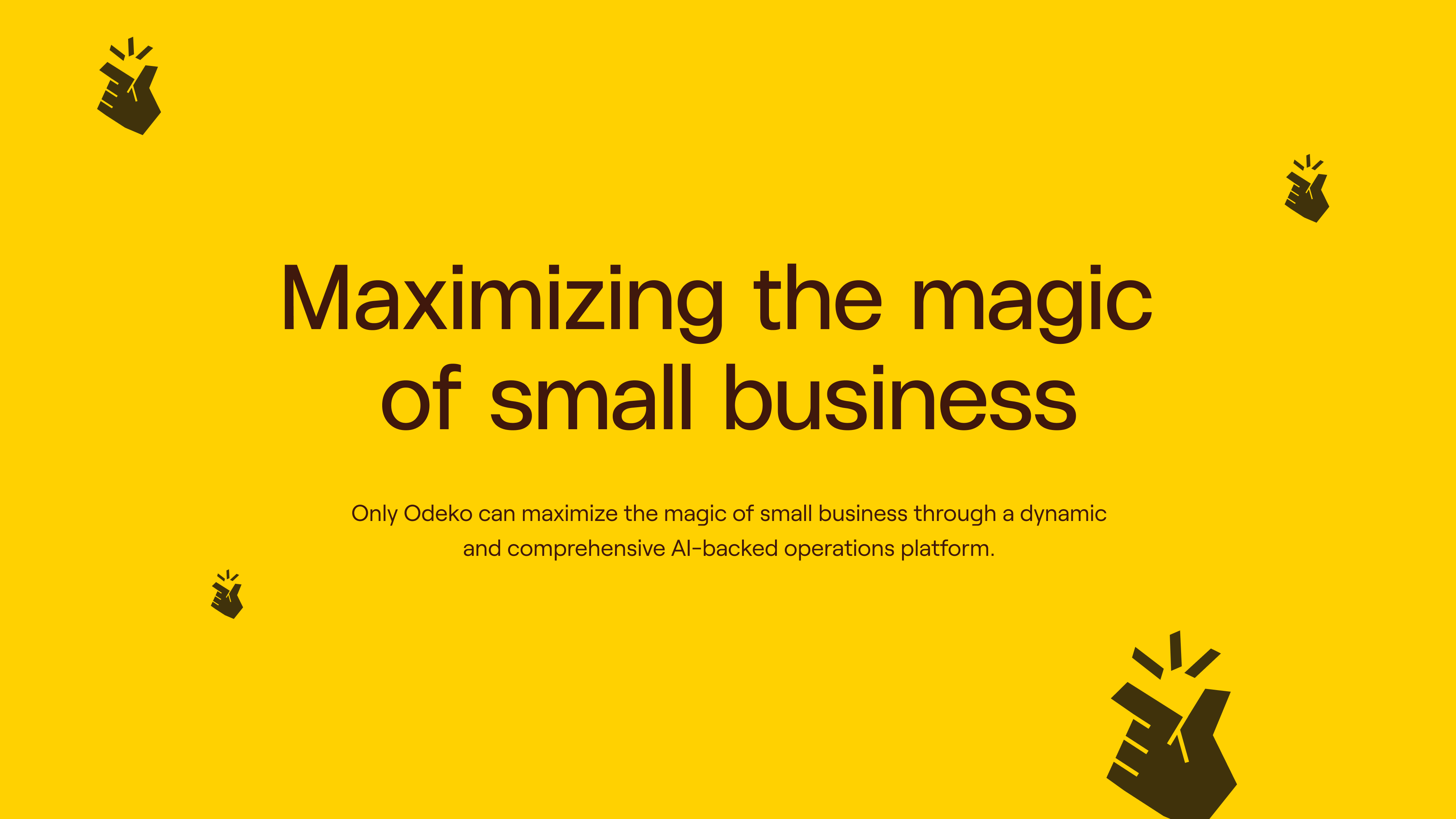
Odeko Rebrand
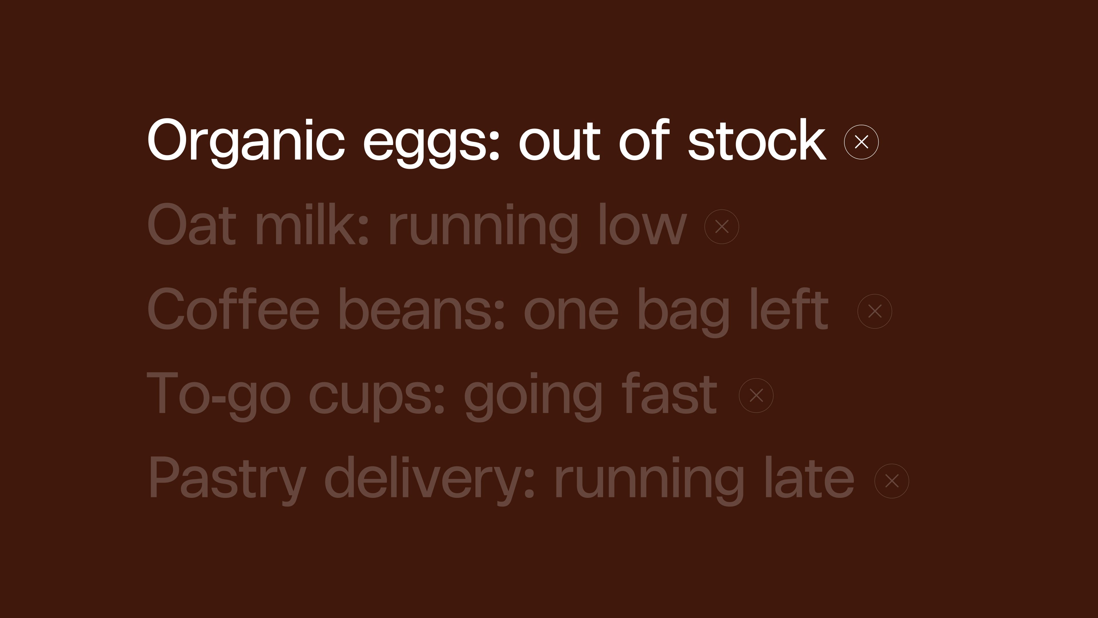
Odeko is Tools intentionally designed to help local coffee shops, cafés, and bakeries operate and grow.
The goal is to build the only farm-to-customer platform that makes it easier and cheaper for local suppliers and retailers to run their businesses, while offering unparalleled convenience and education for their customers.
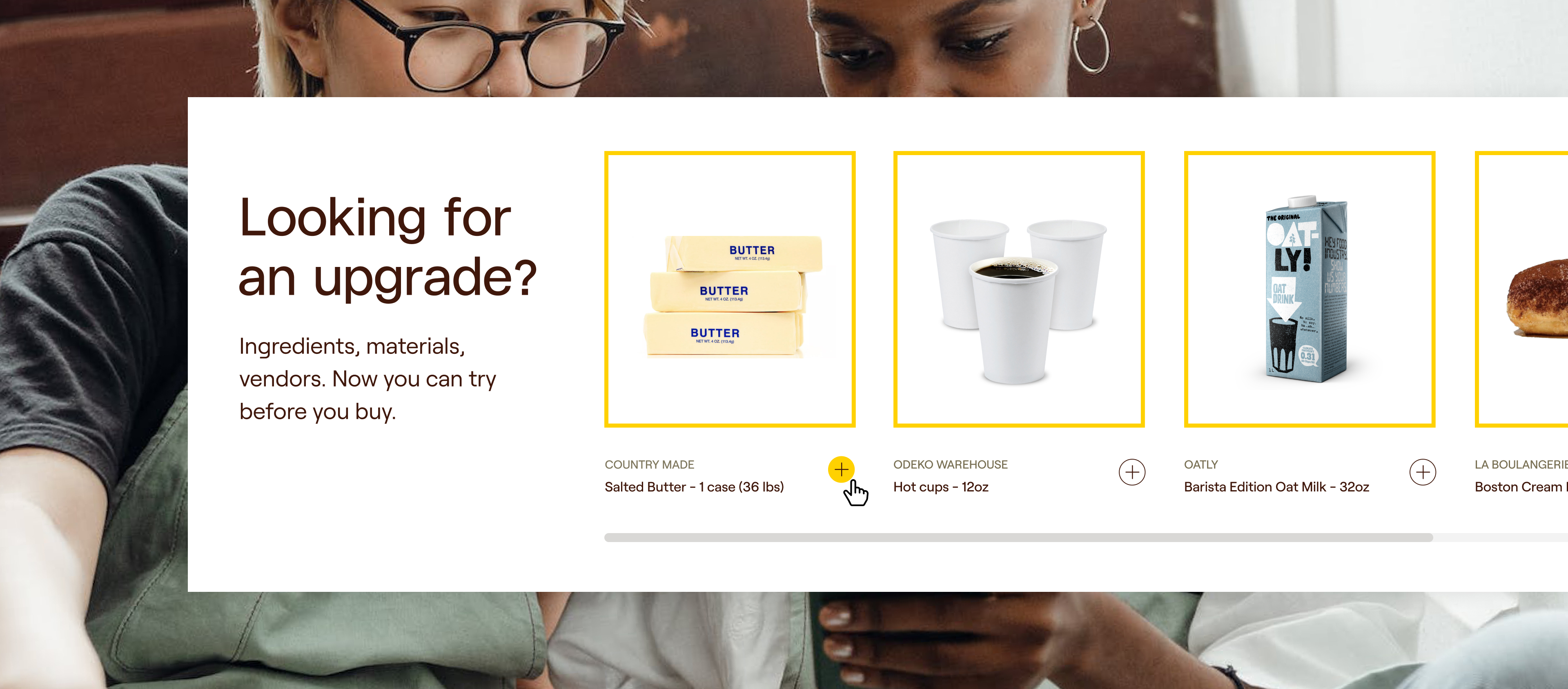
This was a project that involved a crossover between brand and digital. The process involved developing a new identity and whole graphic system for their re-launch. I worked closely with the digital team to make sure the visual language was streamlined across web and product.
Deliverables
— Brand Strategy
— Brand Identity
— Brand Guidelines
— Website Design


Credits:
Client:
Odeko
Agency:
Red Antler
Executive Creative Director:
Jenna Navitsky
Creative Directors:
Erin Collis
Strategy:
Mariel Nardi
Brand & Digital Designers:
Savannah Walker, Jenn Flores, Trista Yard

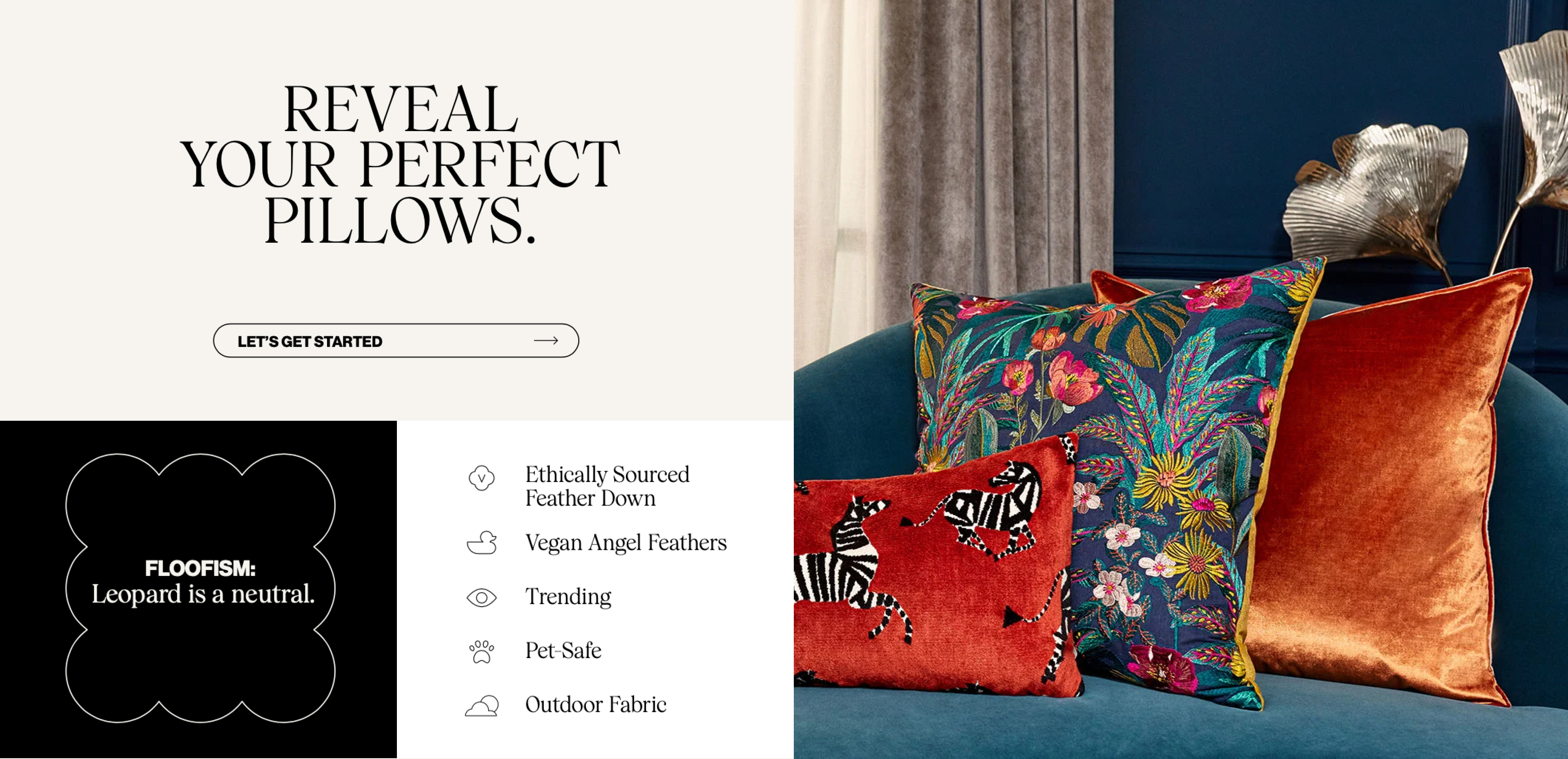
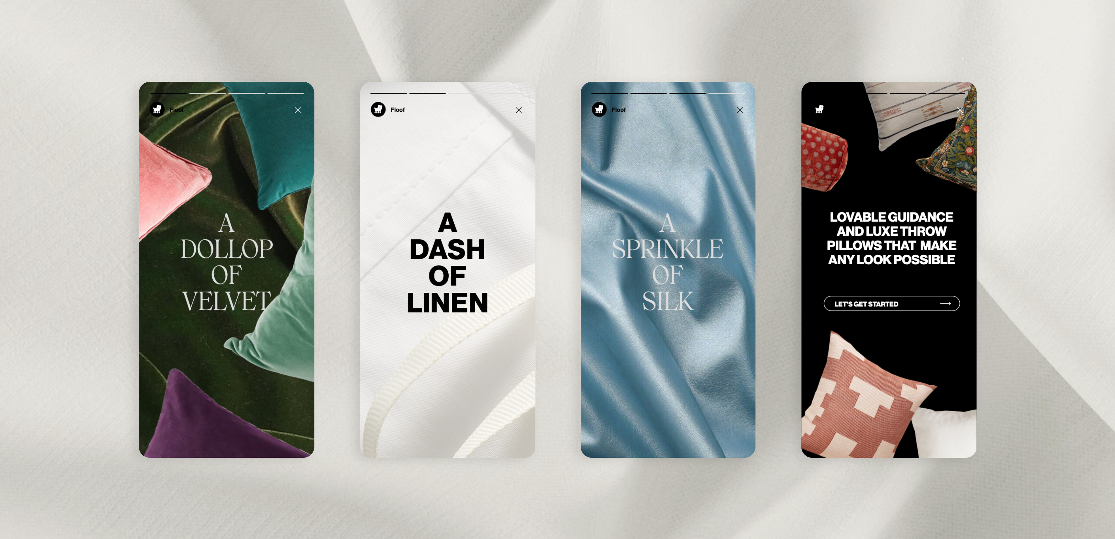
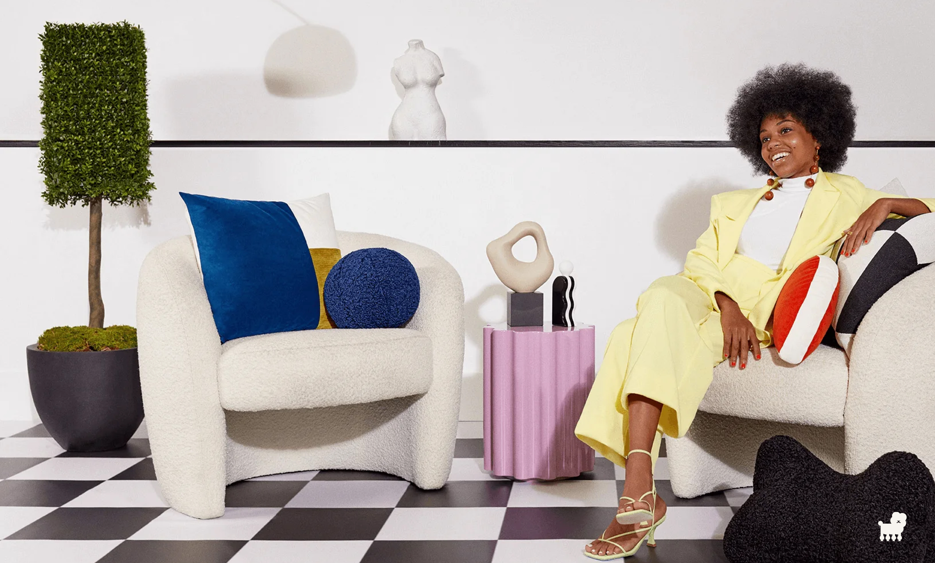
Floof Brand Identity
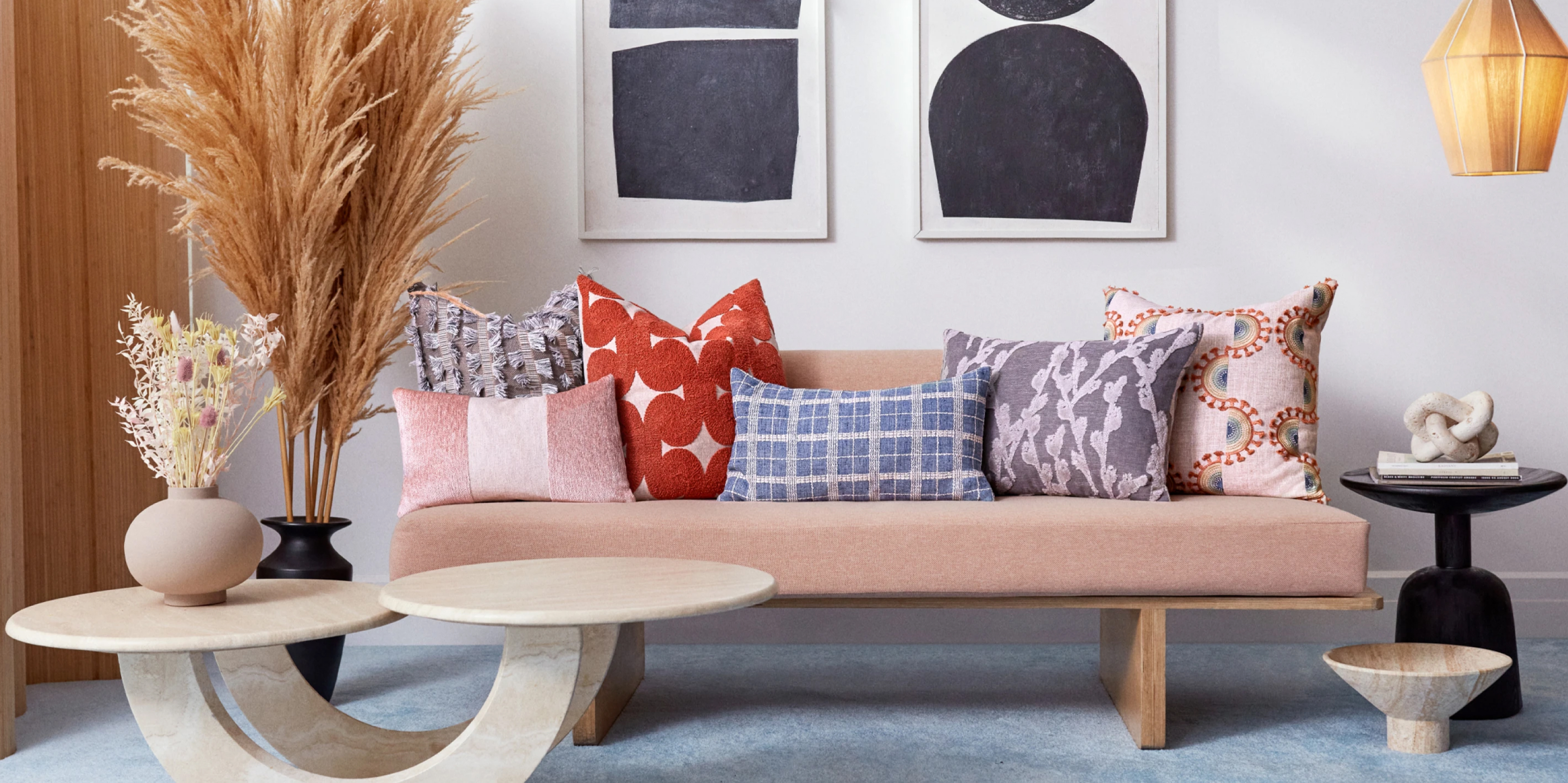
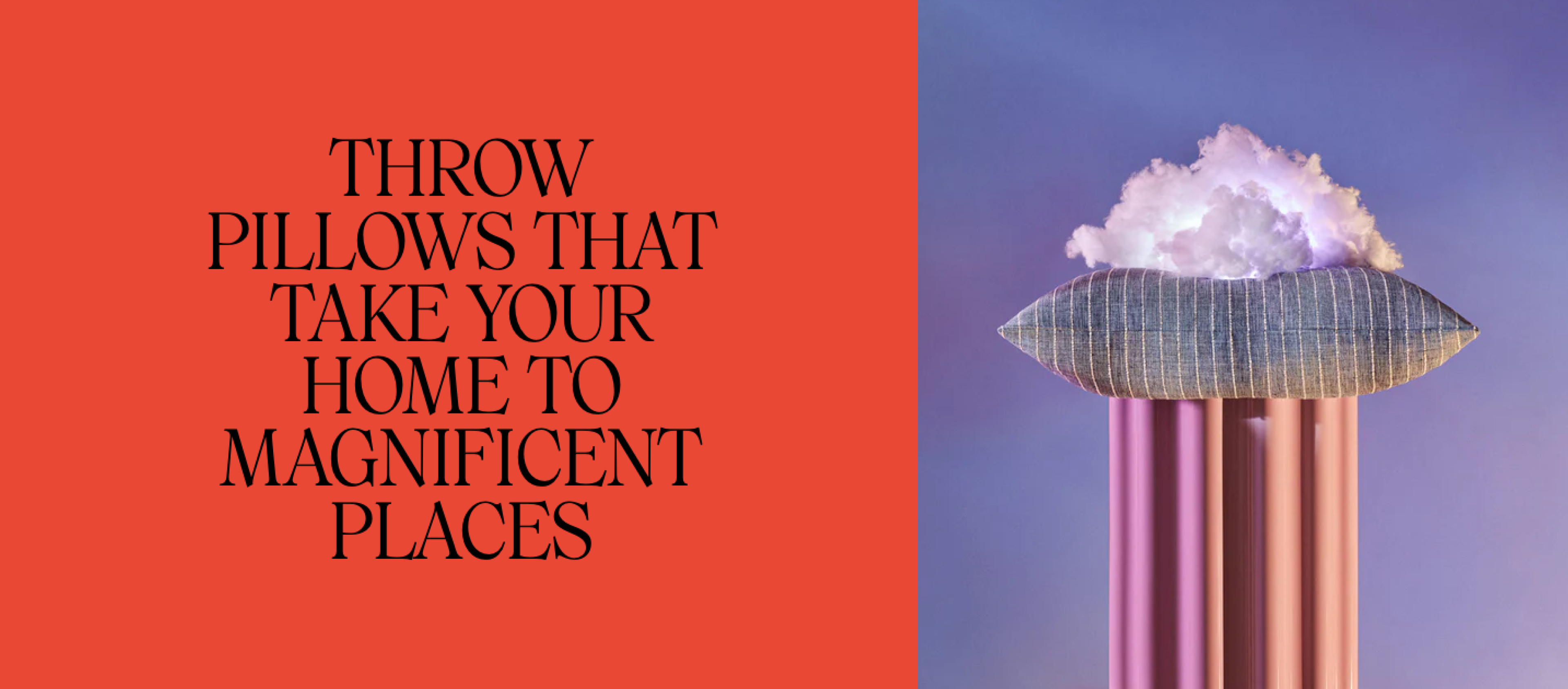
The home design company that
joyfully guides you to the perfect pillows
to lift your space and your spirits. We aim to present comfort in the context of quality and style.
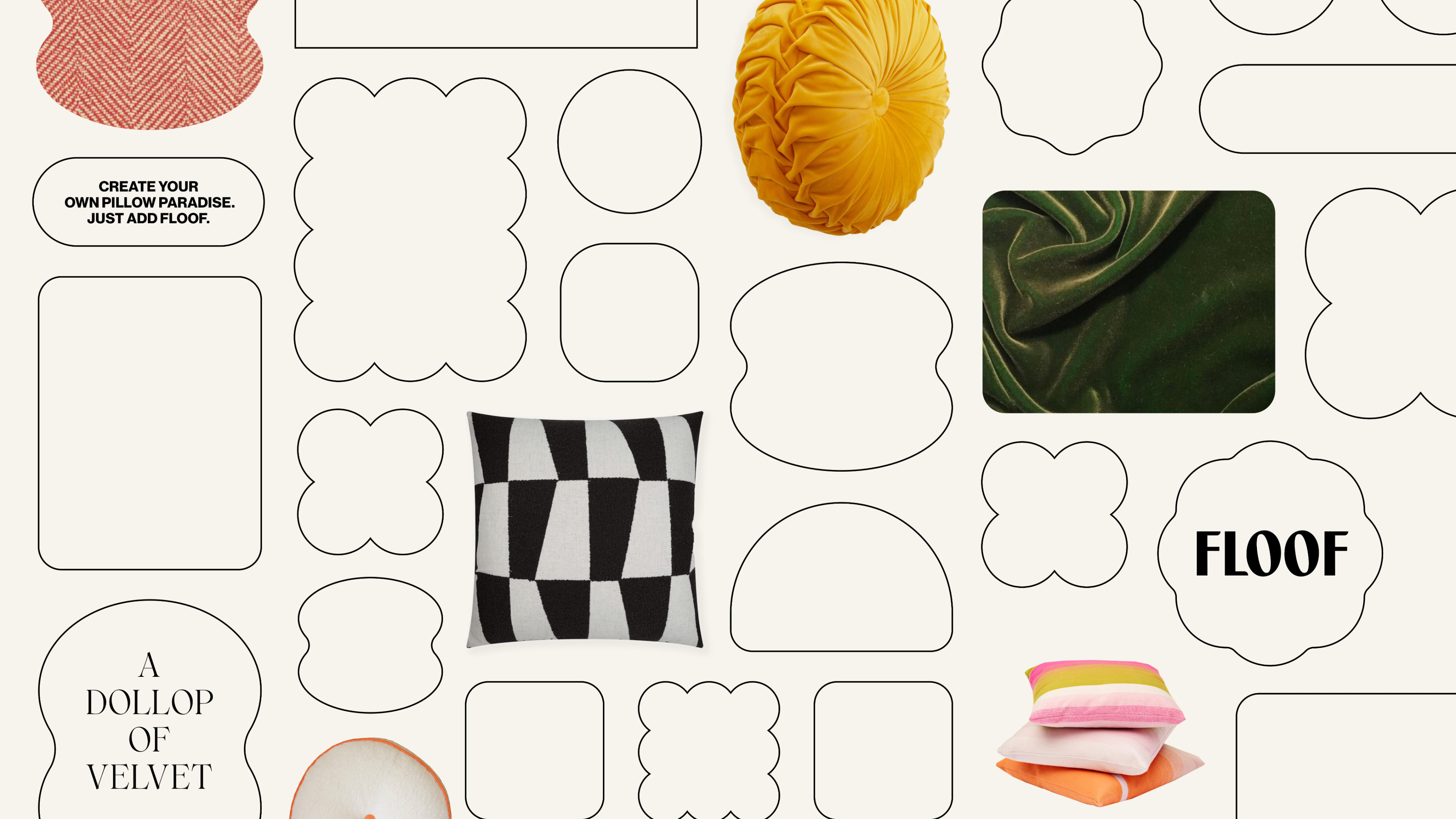
The floof world has been created around the brand idea of making wonderland real. We want to show people that pillows are so much more than
décor by highlighting their power to transform,
refresh, and polish.

The idea of a magical creature that embodied ‘floof’ was something we wanted to explore. Inspired by the quality of the product I created this graphic soft cushionlike shape that served as a base for the poodle inspired creature. Throughout the process we also explored it’s features, stance and continued onto refining it until reaching our final brand symbol.


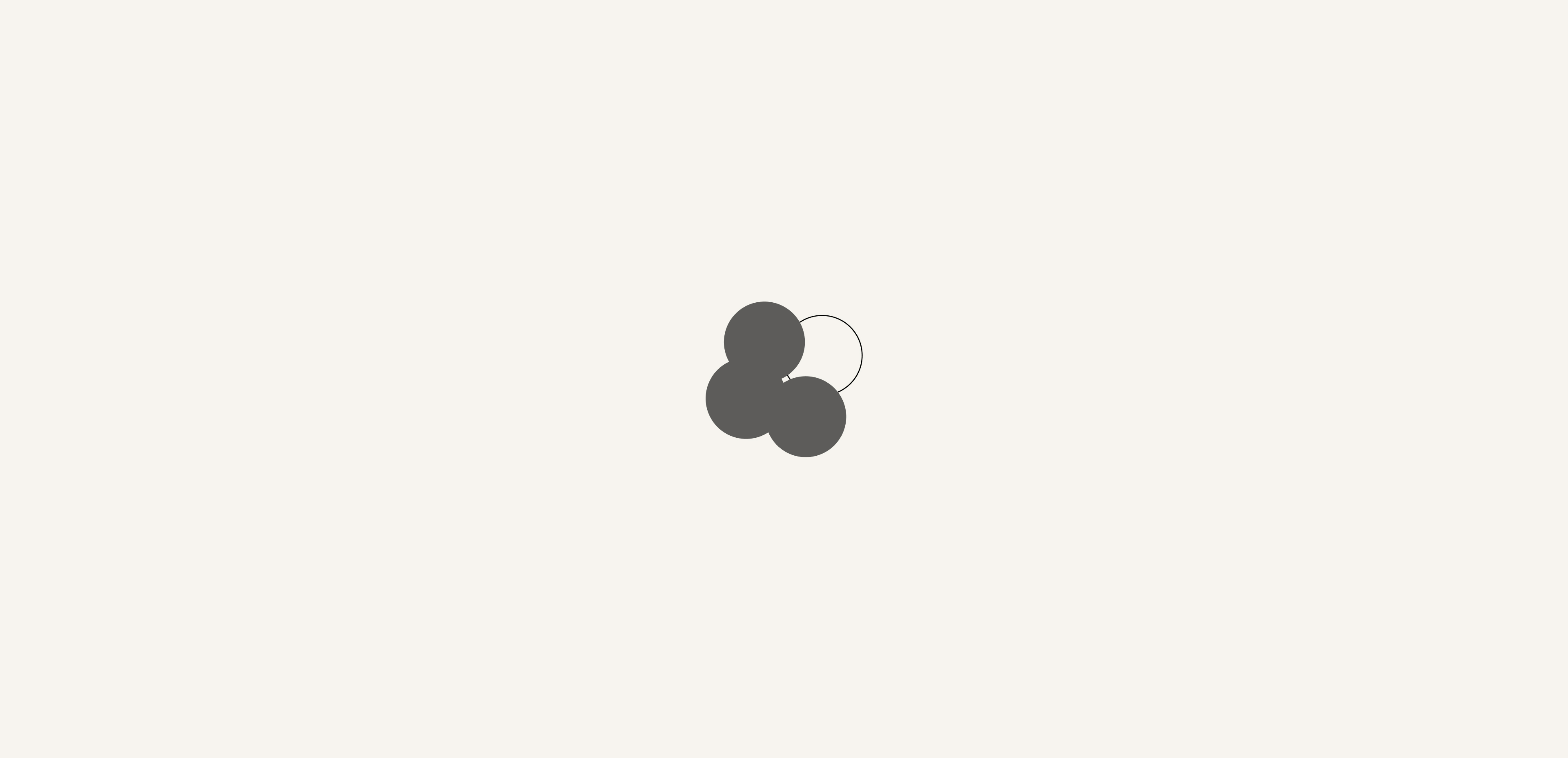
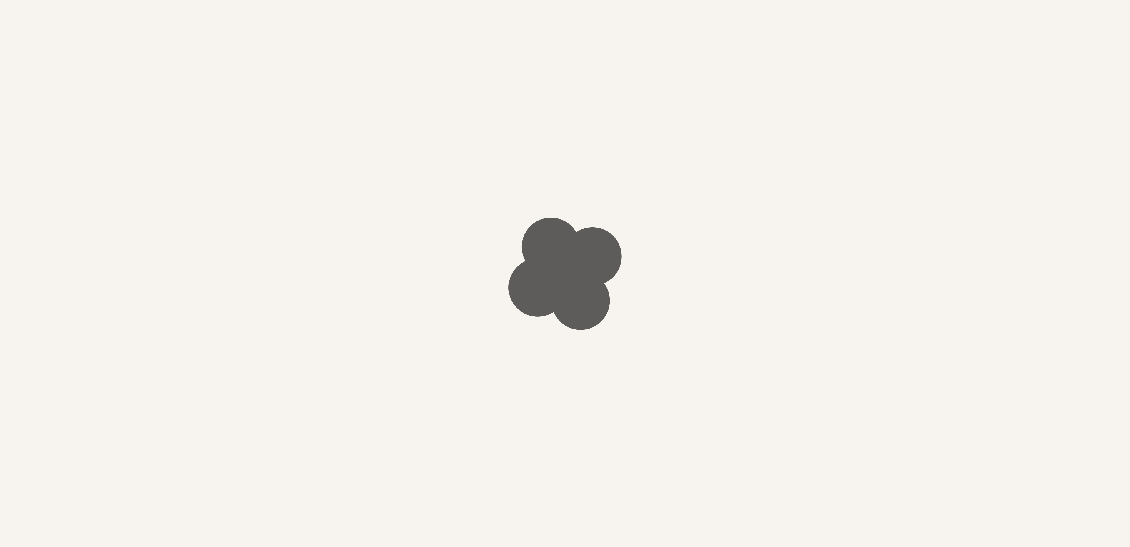

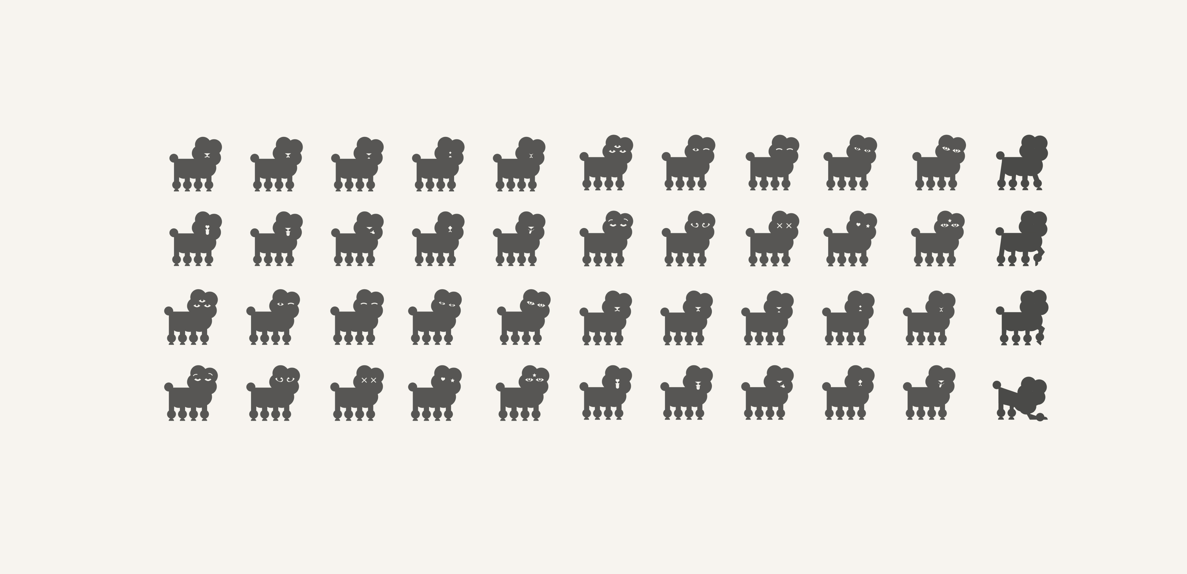
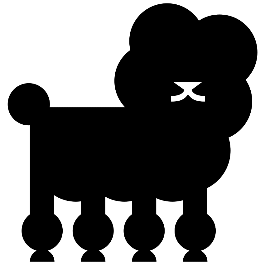
Meet our poodle, our brand symbol that acts as a secondary mark for
the brand. It provides an element of playful brand expression, while visually connecting the elegance of our wordmark to the plush
comfort of our product. Sophistication and softness are captured in the round geometric curves and streamlined forms, while a hint of the poodle’s nose and mouth provide a bit of charming personality, ensuring our brand is always inviting and approachable.
It also behaves as the embodiment of guidance, appearing to offer inspiration and expertise, and letting people know they’re supported every step of the way.
It also behaves as the embodiment of guidance, appearing to offer inspiration and expertise, and letting people know they’re supported every step of the way.

Credits:
Client:
Floof
Agency:
Red Antler
Executive Creative Director:
Jenna Navitsky, Erin Collis
Design Director:
Sarah Schiesser
Designers:
Bex Zank, Jenn Flores
Interactive Designer
Kaily Gillan
Implementation:
Avex Design

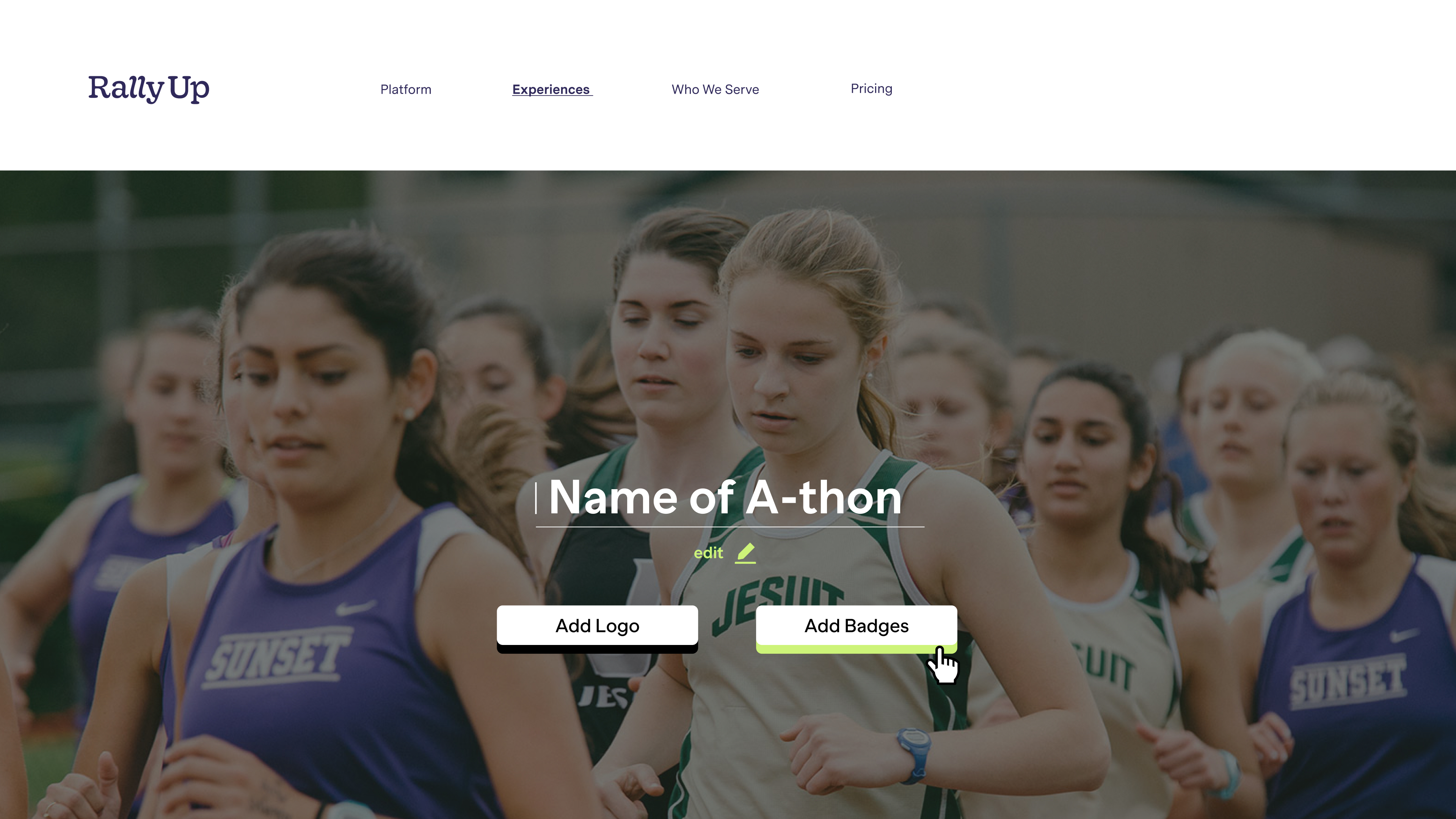
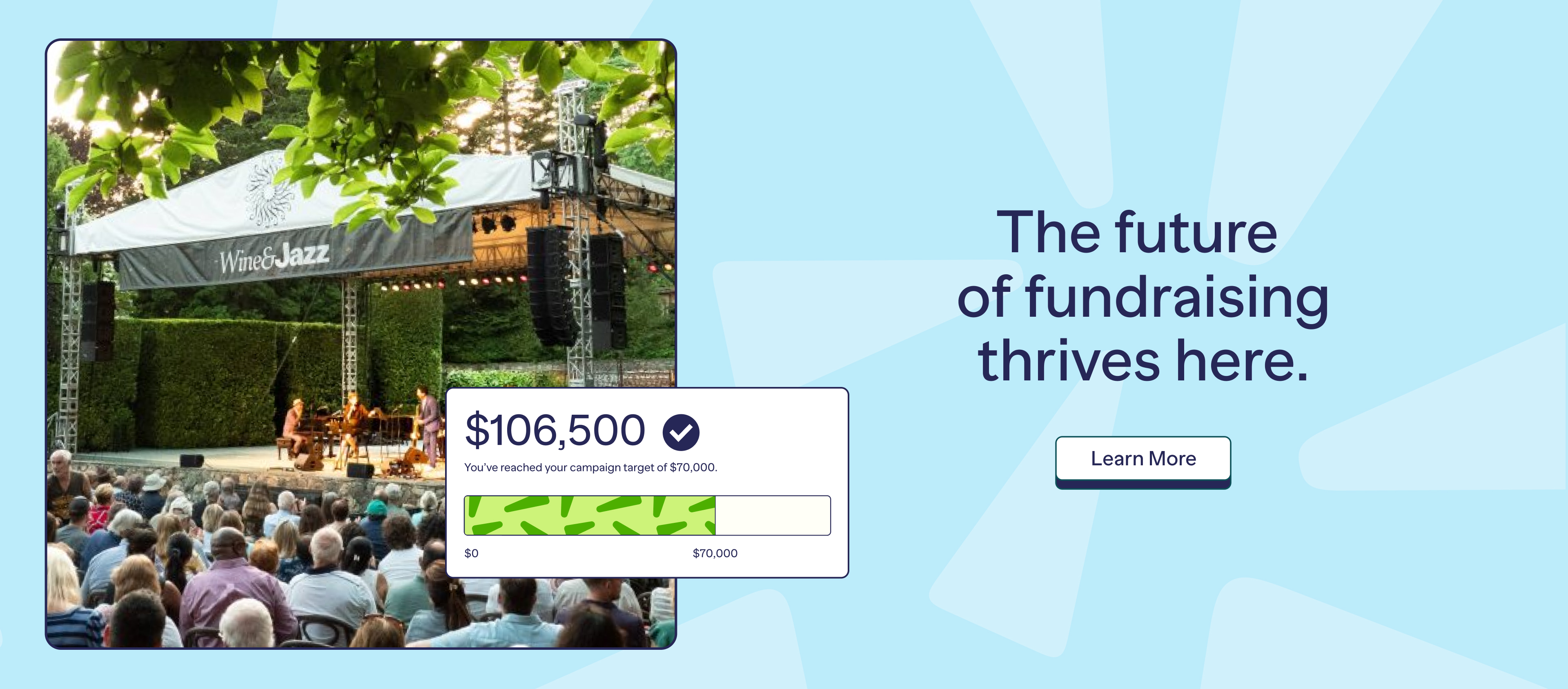
RallyUp Brand Identity
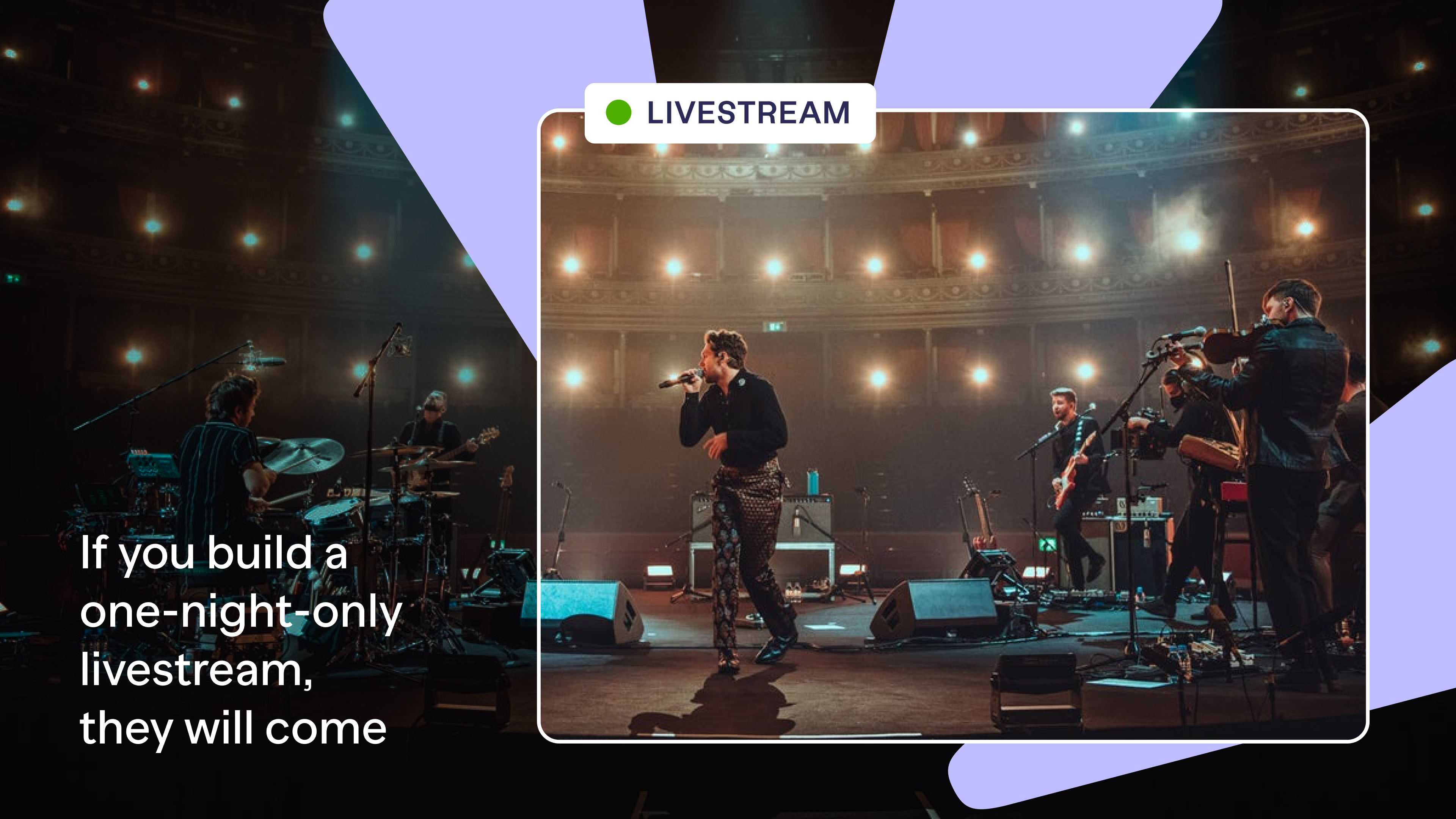
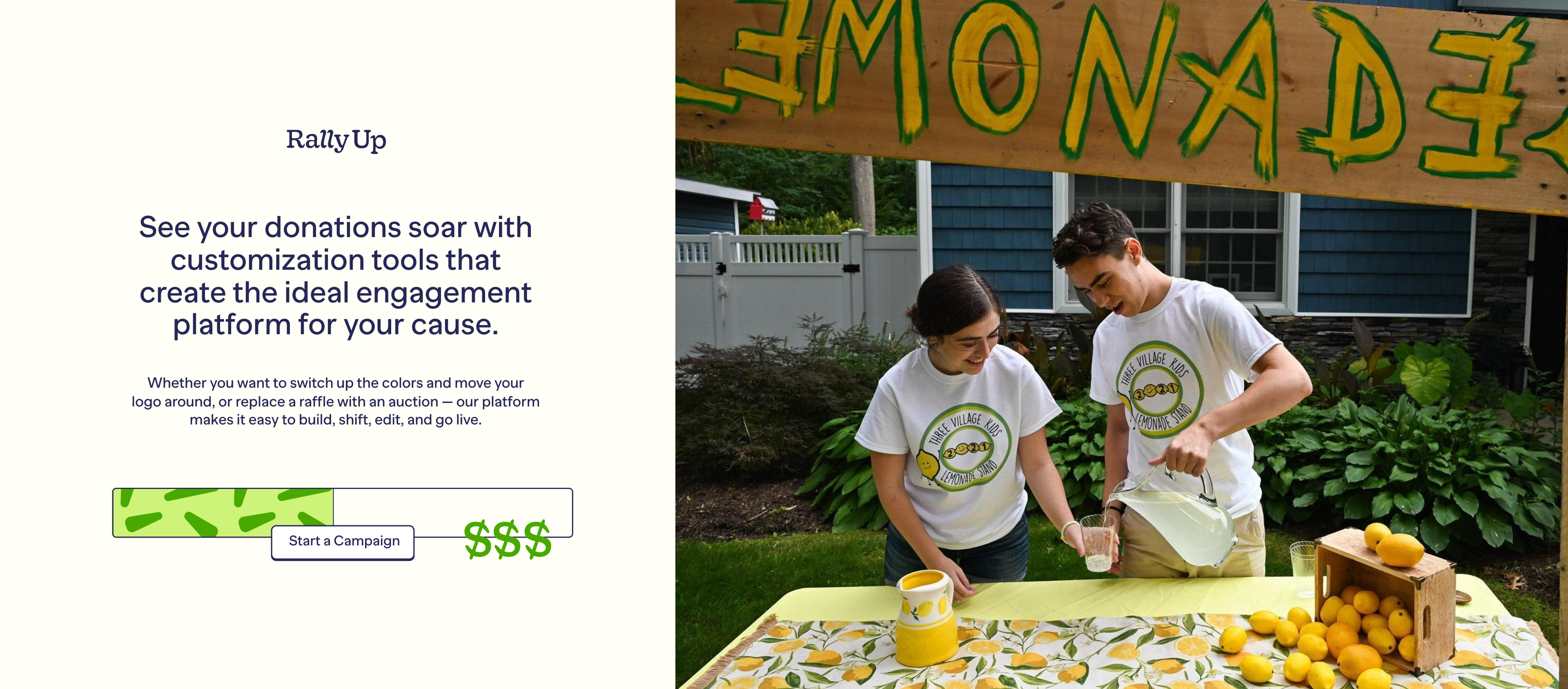
You want to engage an audience with your cause, but the more attention-worthy you try to make an experience—with a special item auctioned, a one-night concert, or a local sale—the fewer people might be able to take part. In trying to draw people in, you actually close so many more out. RallyUp is the giving platform building a marvel that invites a new world of participation in your cause
Deliverables
— Brand Strategy
— Brand Identity
— Brand Guidelines
— Website Design

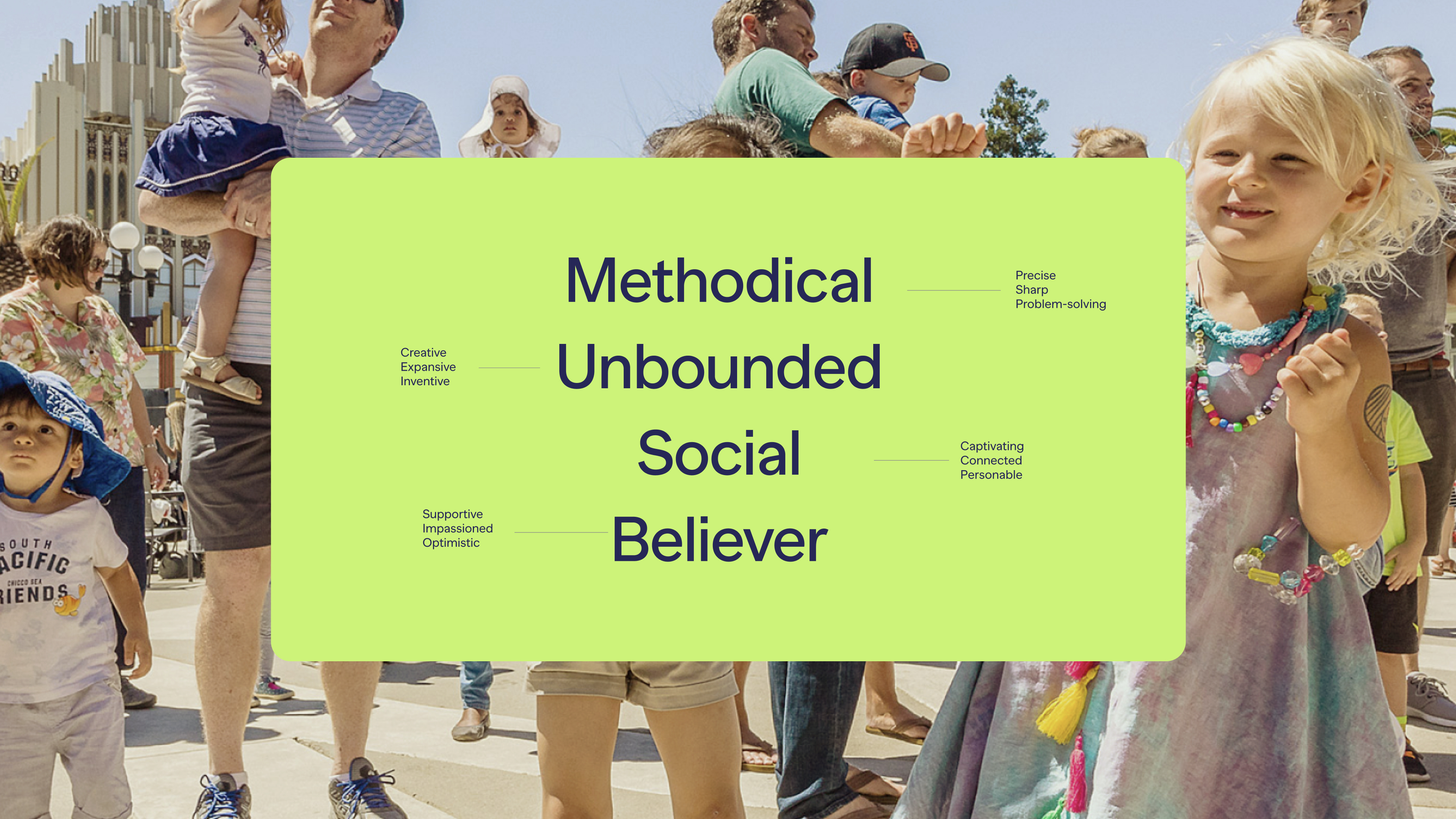
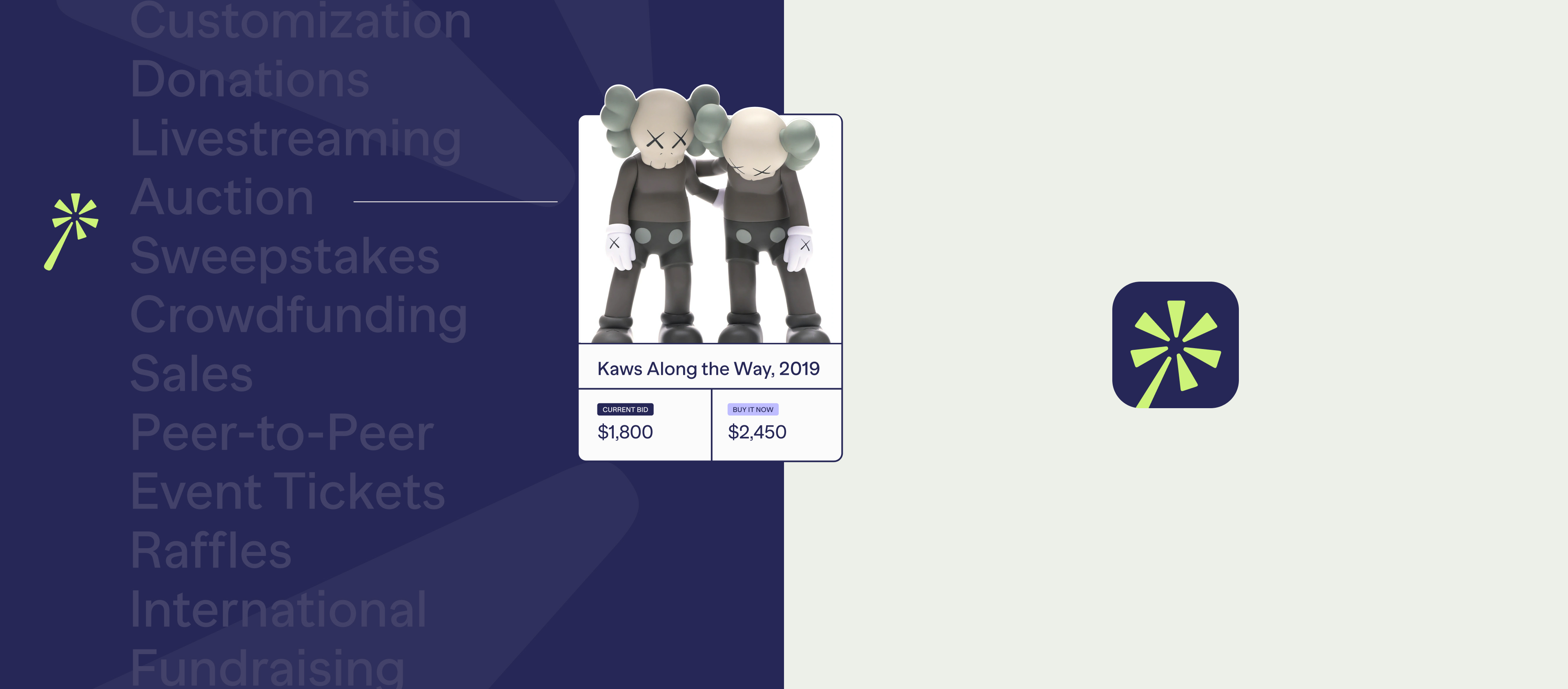
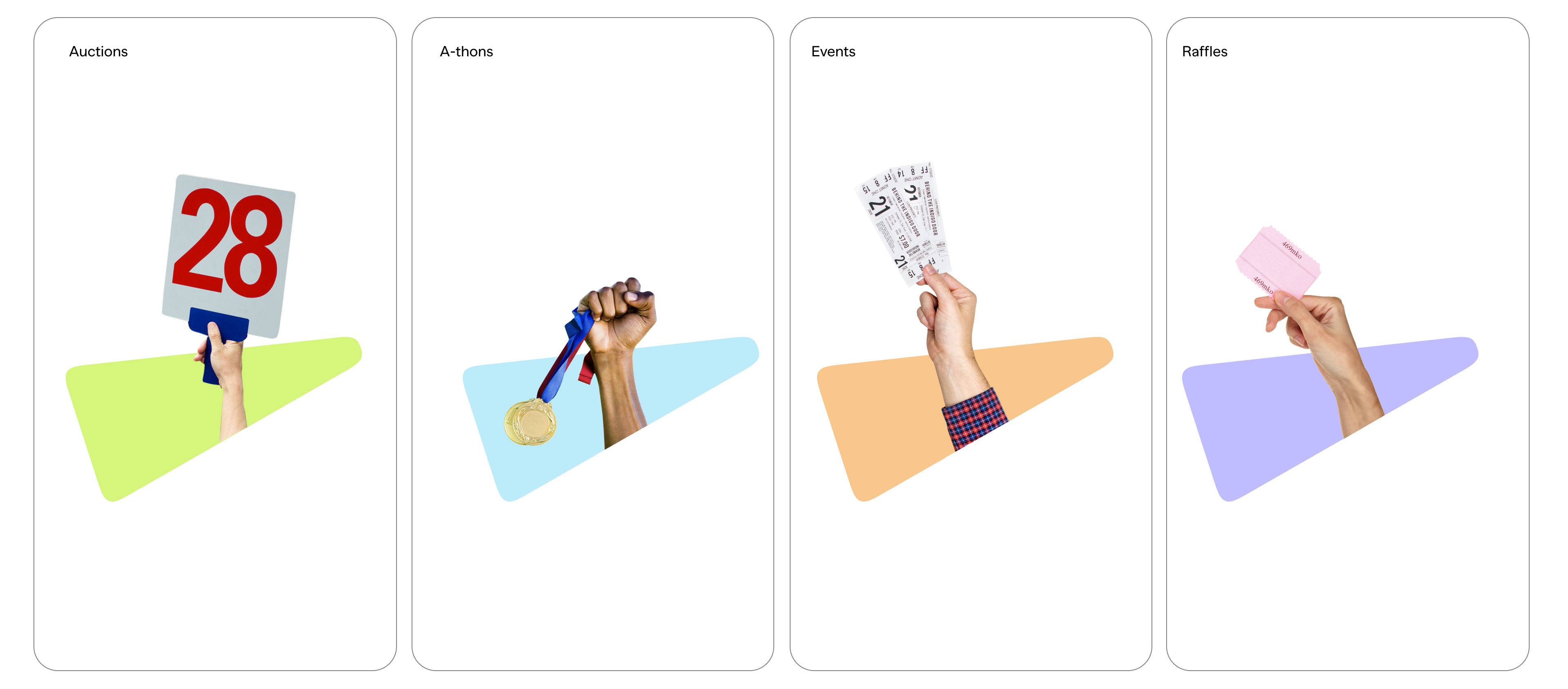
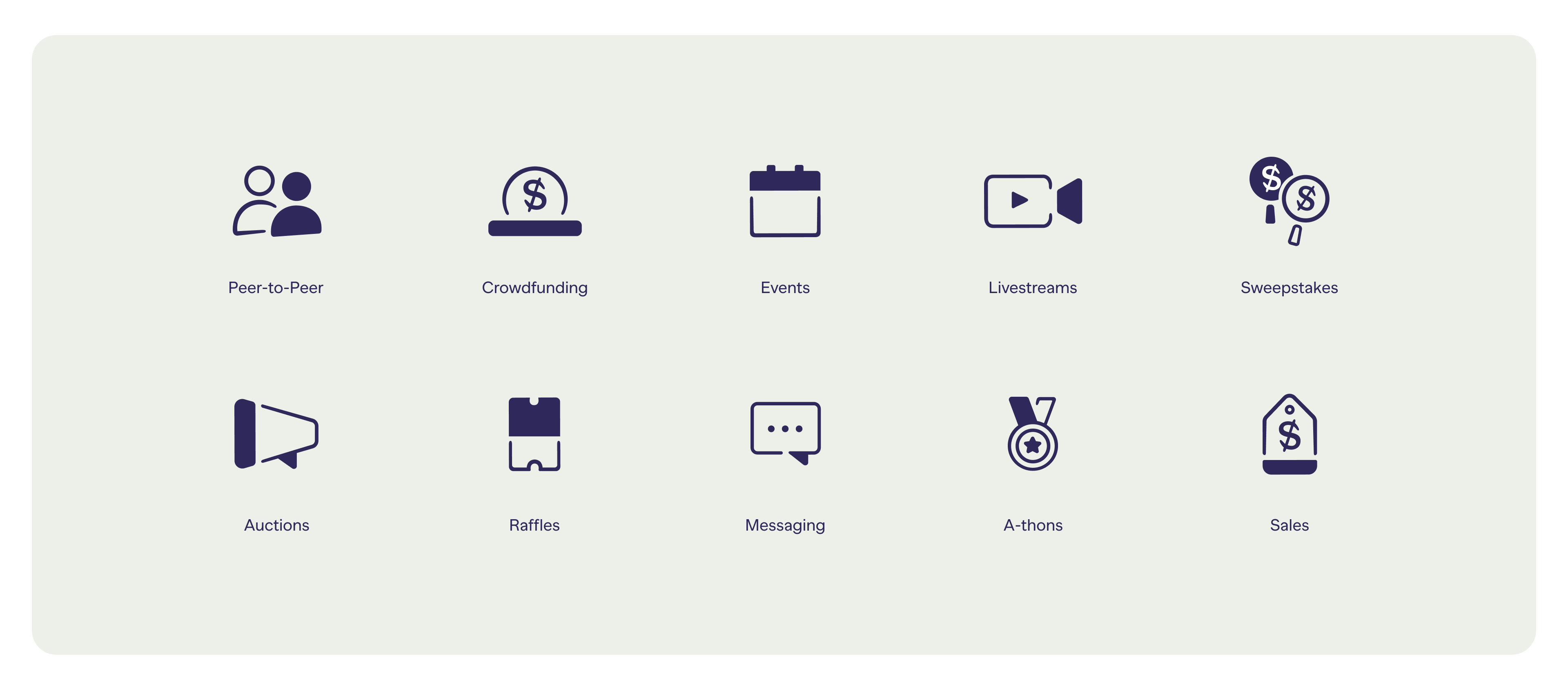
Symbol & Device
Our symbol captures a feeling of marvel that is essential to our platform as it communicates the magical aspect of being able to accomplish a range of experiences through the platform.
We use the spark shape from our wand symbol as a graphic element
that shows all experiences.
Our icons are uniquely crafted to mimic the details in our wordmark. We combine solid shapes with outlines that speak to the dual relationship between our platform and our users.


Credits:
Client:
RallyUp
Agency:
Red Antler
Executive Creative Director:
Erin Collis
Creative Directors:
Franco Castillo
Designers:
Jenn Flores, Hilda Wong, Mia Watson

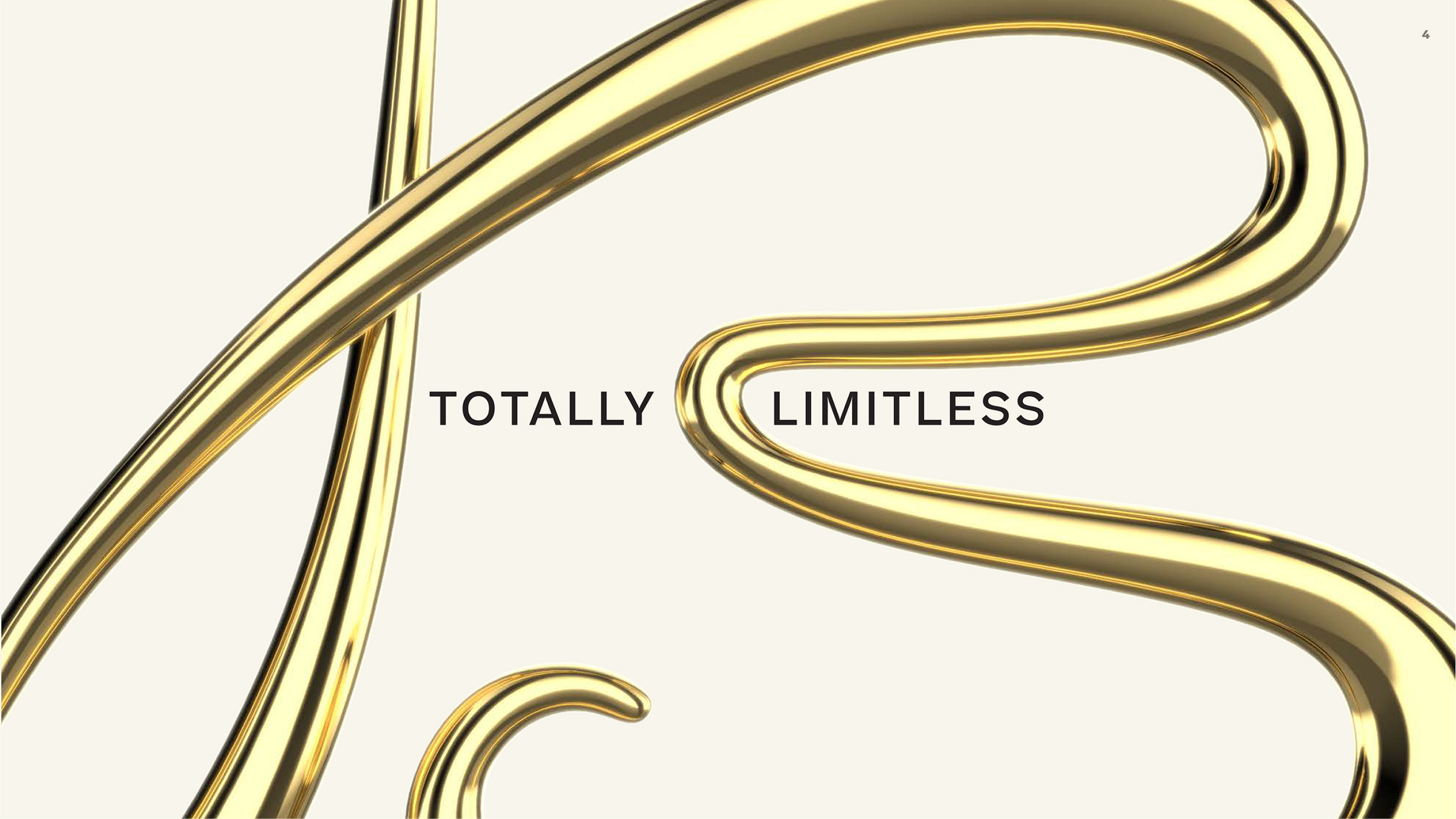
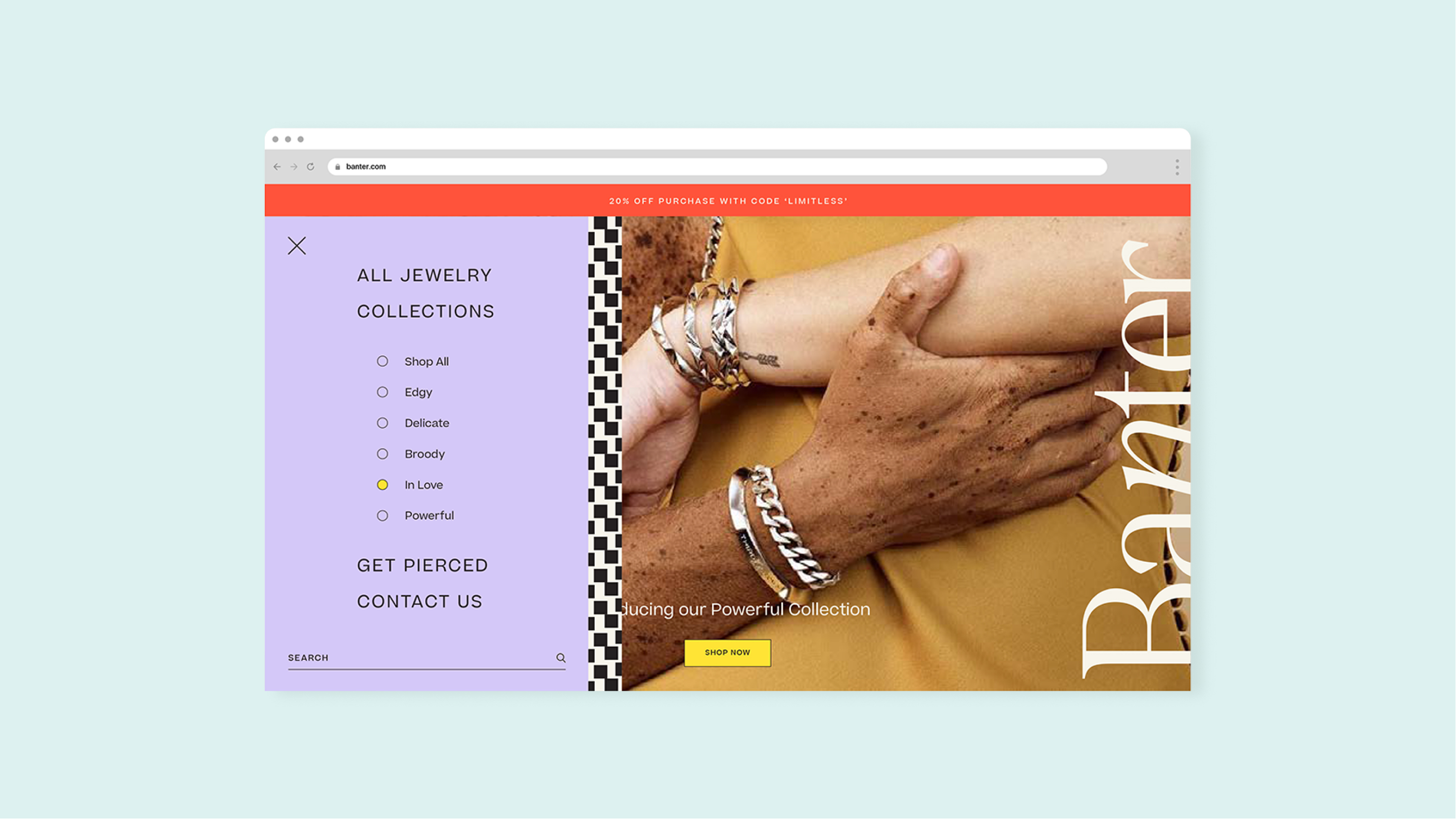
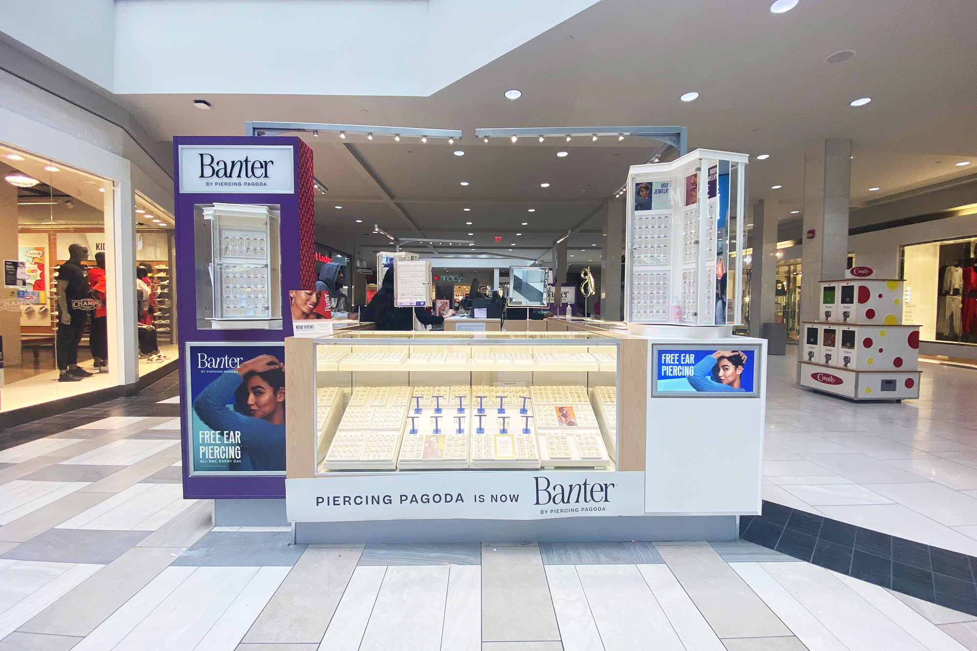
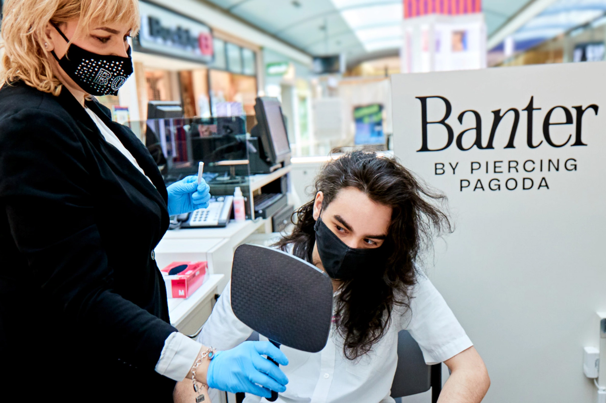
Piercing Pagoda Rebrand
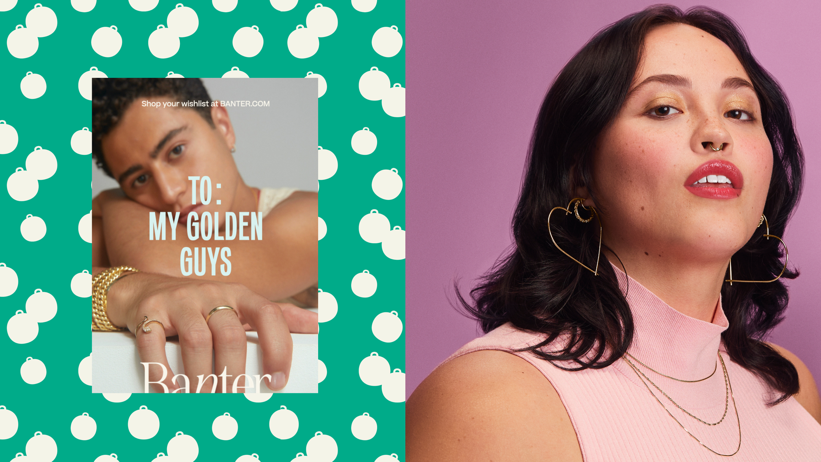
Since 1969, Piercing Pagoda has been widely-known as the gold kiosk leader in shopping malls across the United States and Puerto Rico. It has grown from a single retail location to roughly 780 kiosks and remains the core ear piercing business today. As part of a broad repositioning, the chain’s name changed to Banter by Piercing Pagoda. The relaunch included expanding and opening as many as 100 new Banter locations in malls in 2021, with roughly half of those being enclosed stores.
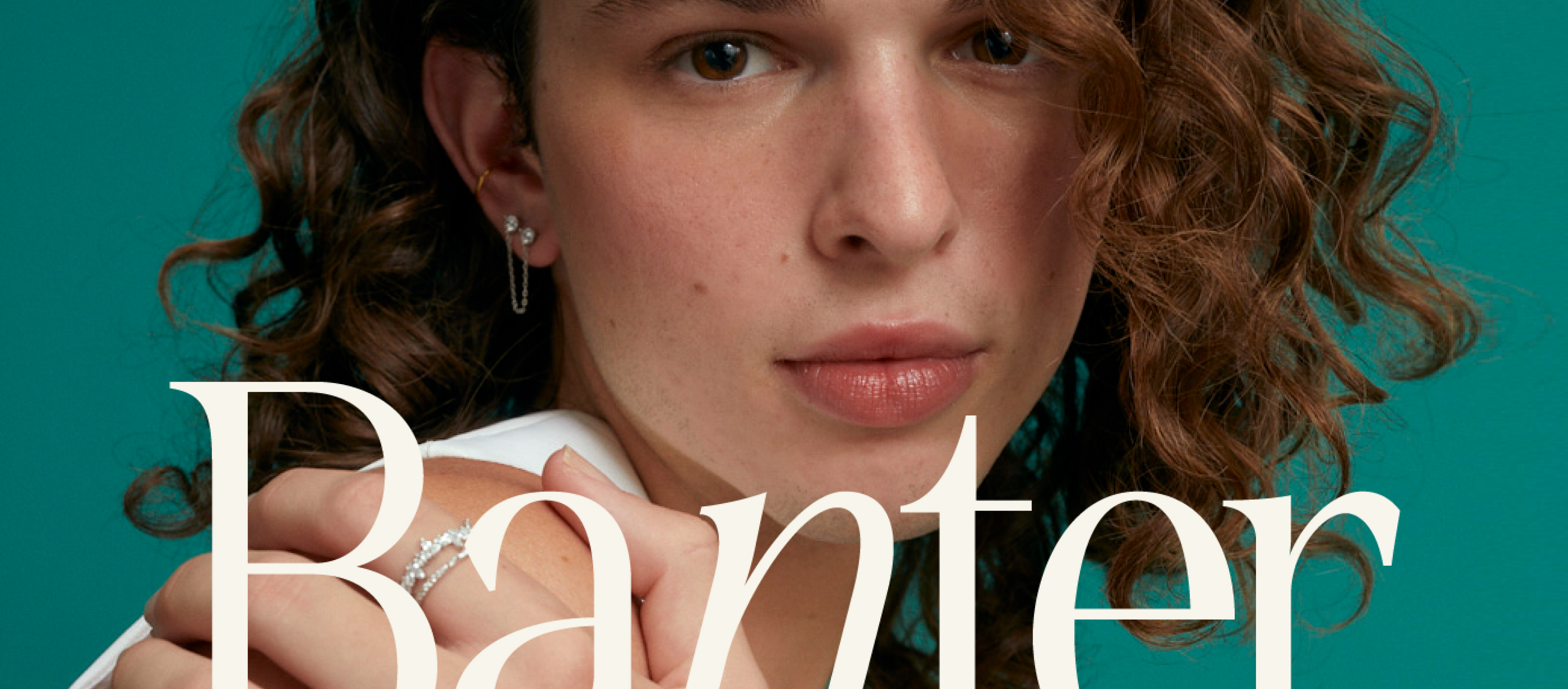
The brand name invokes the excitement of playful conversation, giving us an interesting start point to develop the system.
The process involved exploration of wordmarks, color palettes, symbols, iconography, digital applications and a look into content activation for their 2021 Holiday Campaign. Additionally, we worked in the redesign of their current kiosks and signage.

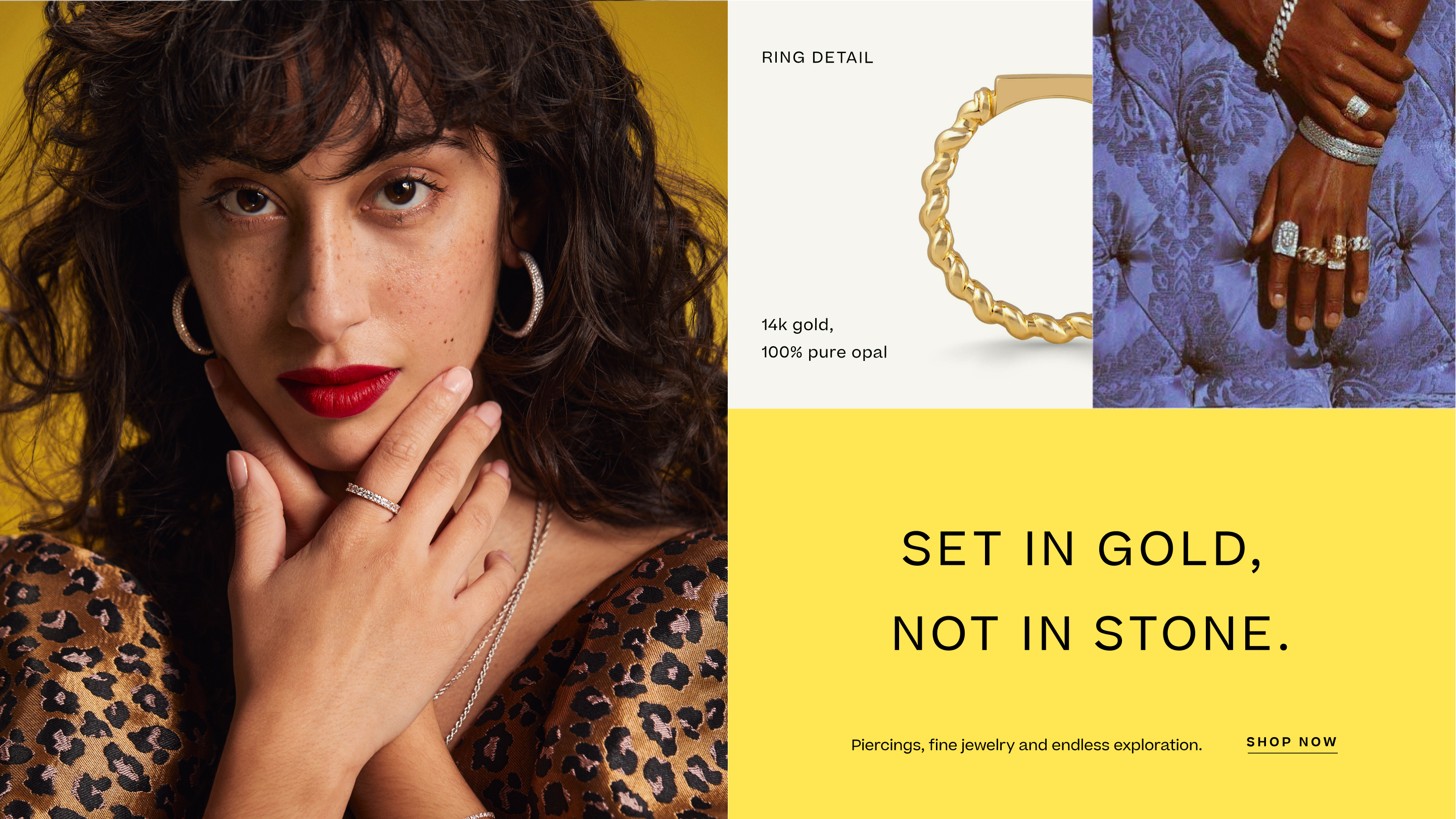

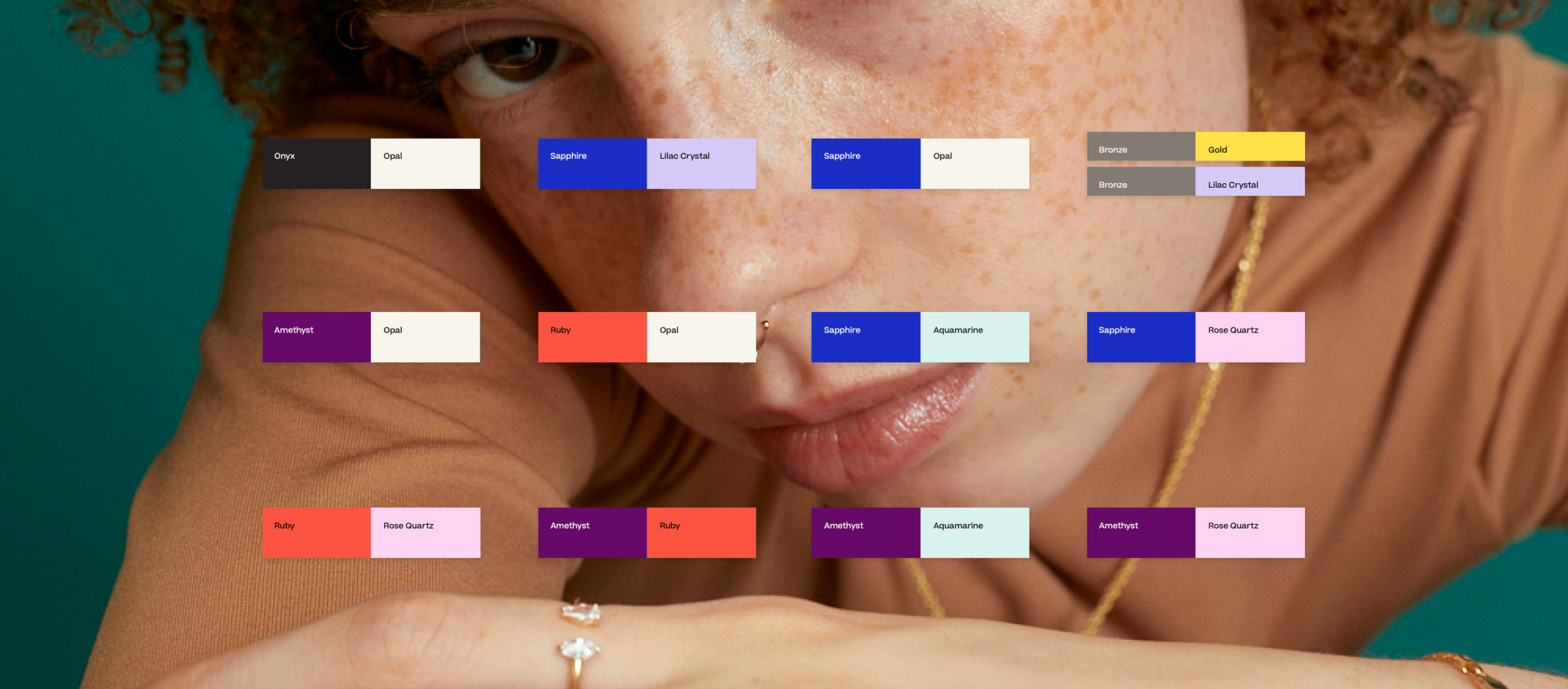
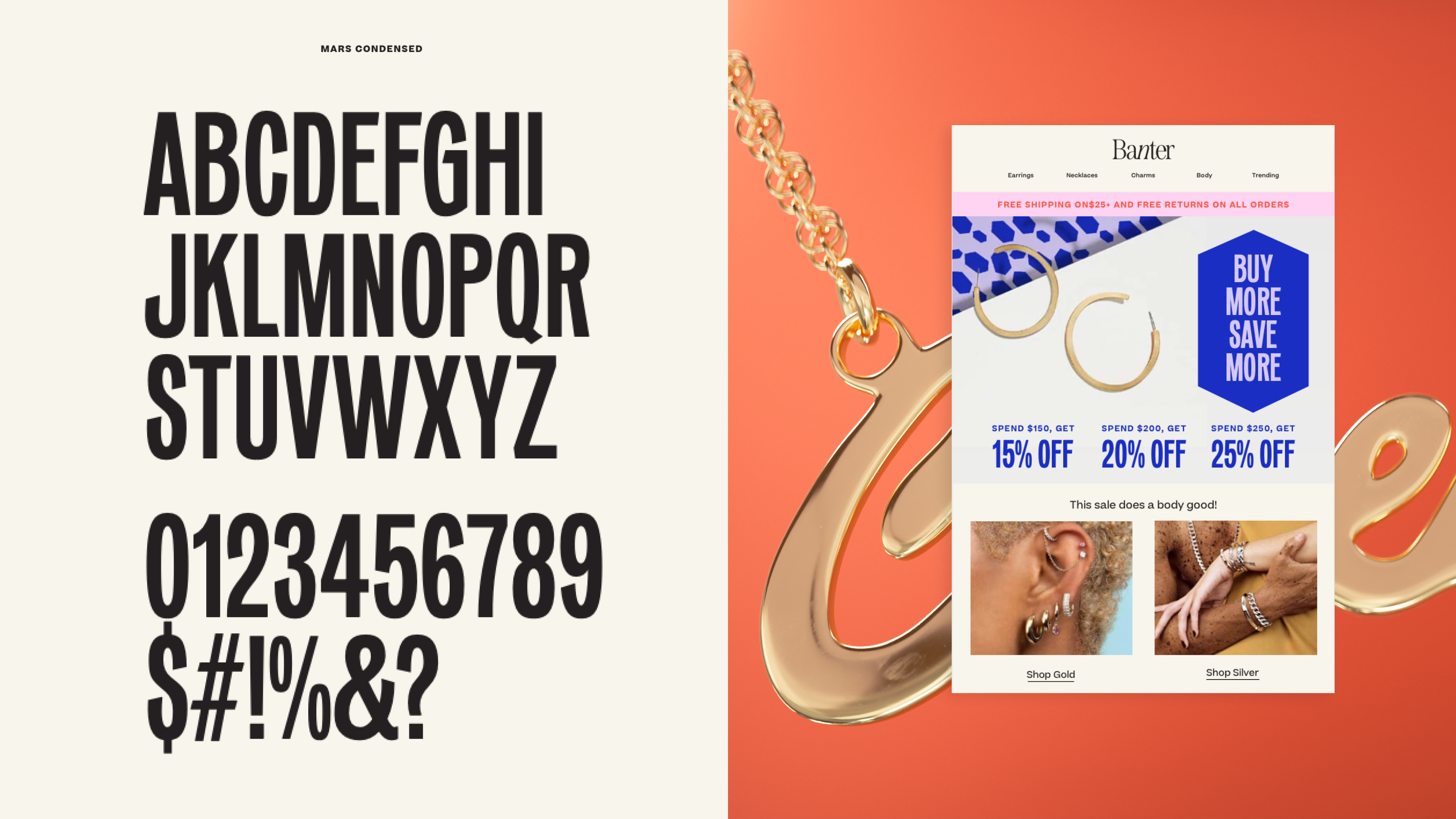

Our iconography system is dainty
and slick. Their fine detail brings
us back to jewelry in every corner.
Our gilded icons are our hero icons, making a piece of communication very special and our functional icons are utilitarian and mainly found digitally.
Our gilded icons are our hero icons, making a piece of communication very special and our functional icons are utilitarian and mainly found digitally.


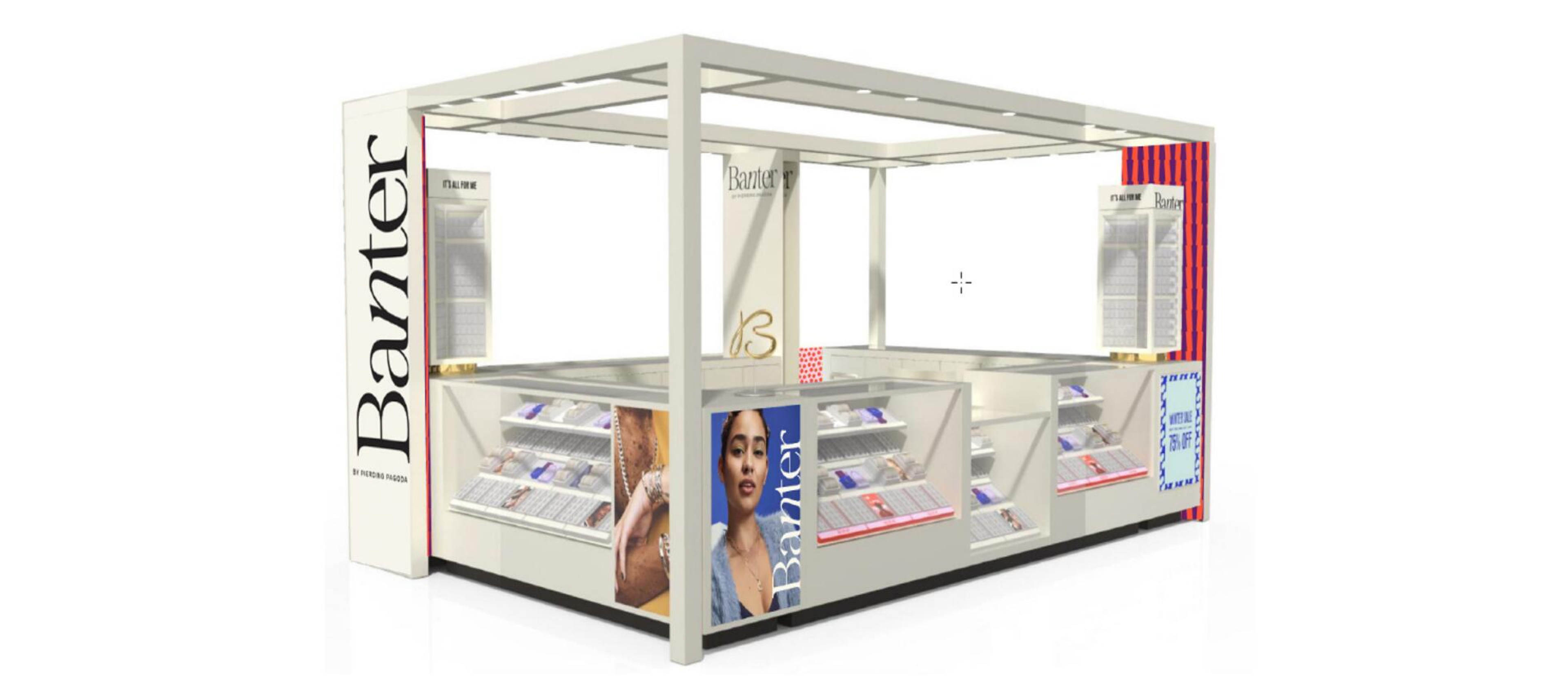
Renders
Mall Kiosk &
Jewelry Trays
Mall Kiosk &
Jewelry Trays


Rebrand in situ
Photo credits: Banter California, Banter Georgia, Banter New York


Credits:
Client:
Banter by Piercing Pagoda
Agency:
Red Antler
Executive Creative Director:
Jenna Navitsky
Creative Directors:
Lindsay Brillson, Ada Mayer
Design Director:
Margherita Urbani
Strategy:
Marni Kane
Art Directors:
Elisa Werbler, Olivia Ewing
Copywriters:
Cat Williams, Helen Gallagher
Designers:
Bex Zank, Jenn Flores
Industrial Designers:
Christian Poulsen, Lorraine Glover, Kaeo Helder
Production:
Spang