
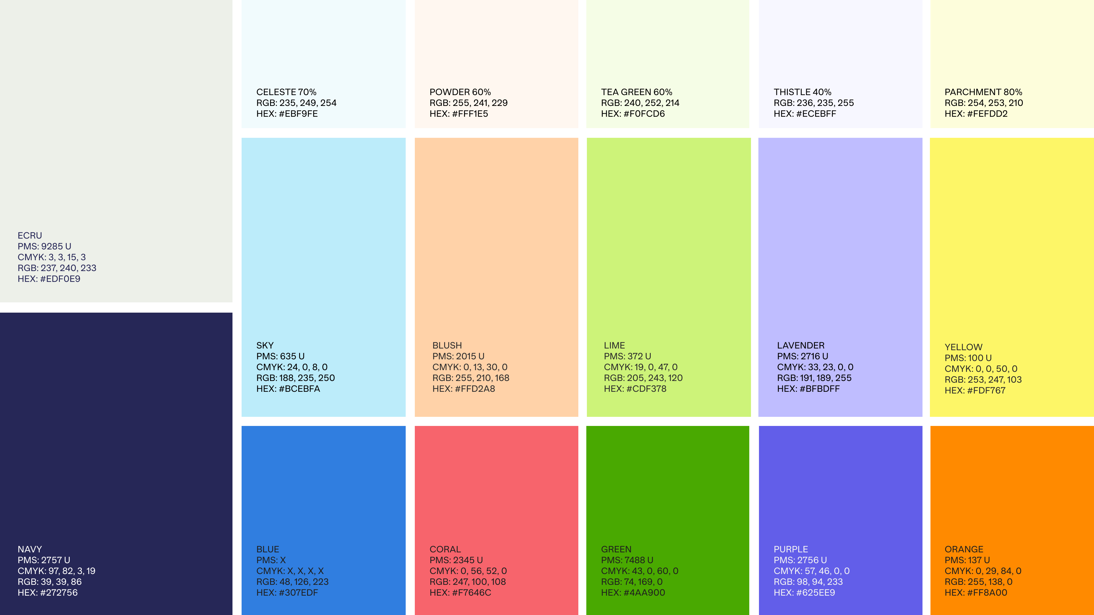
RallyUp Brand Identity
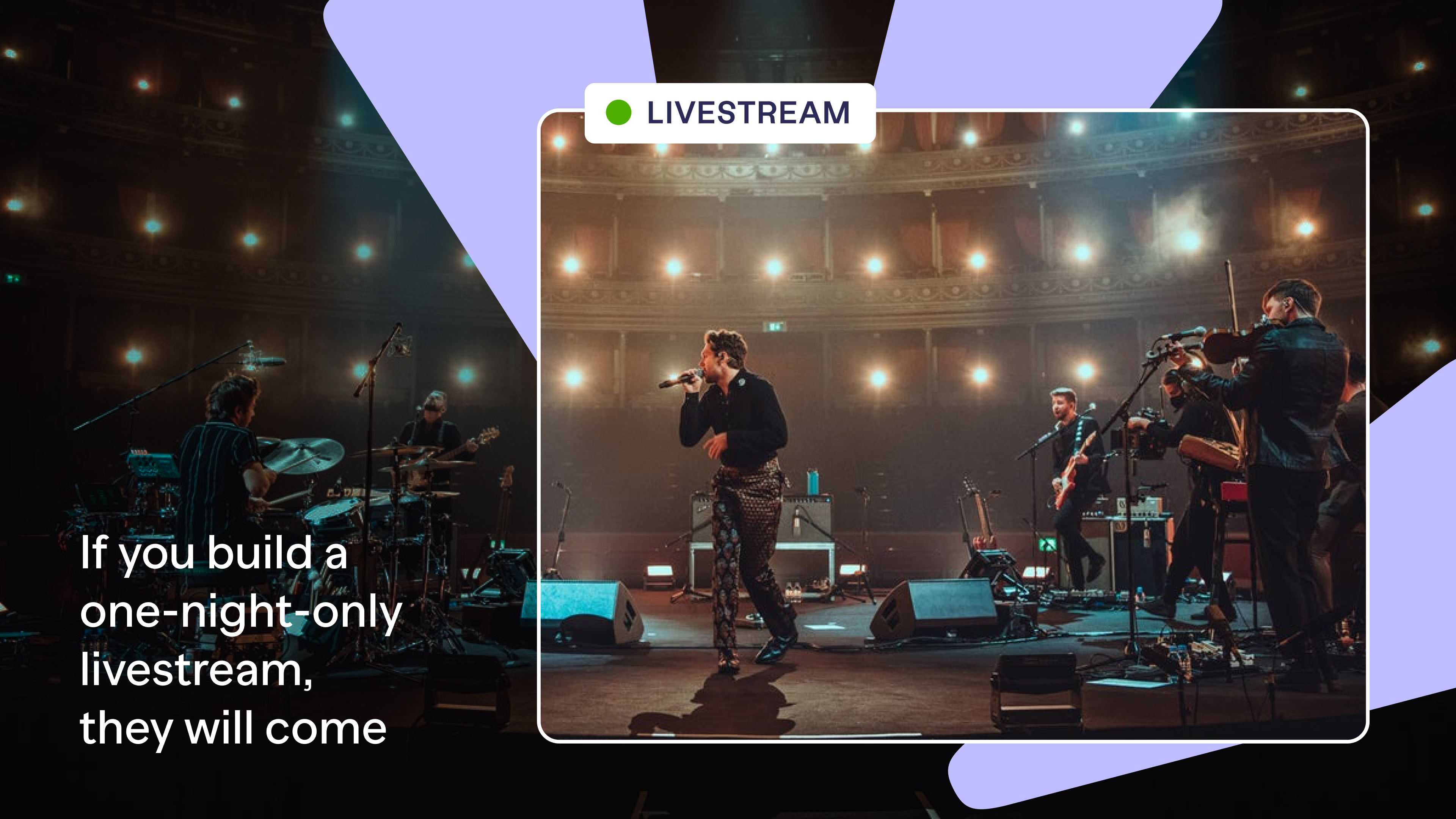
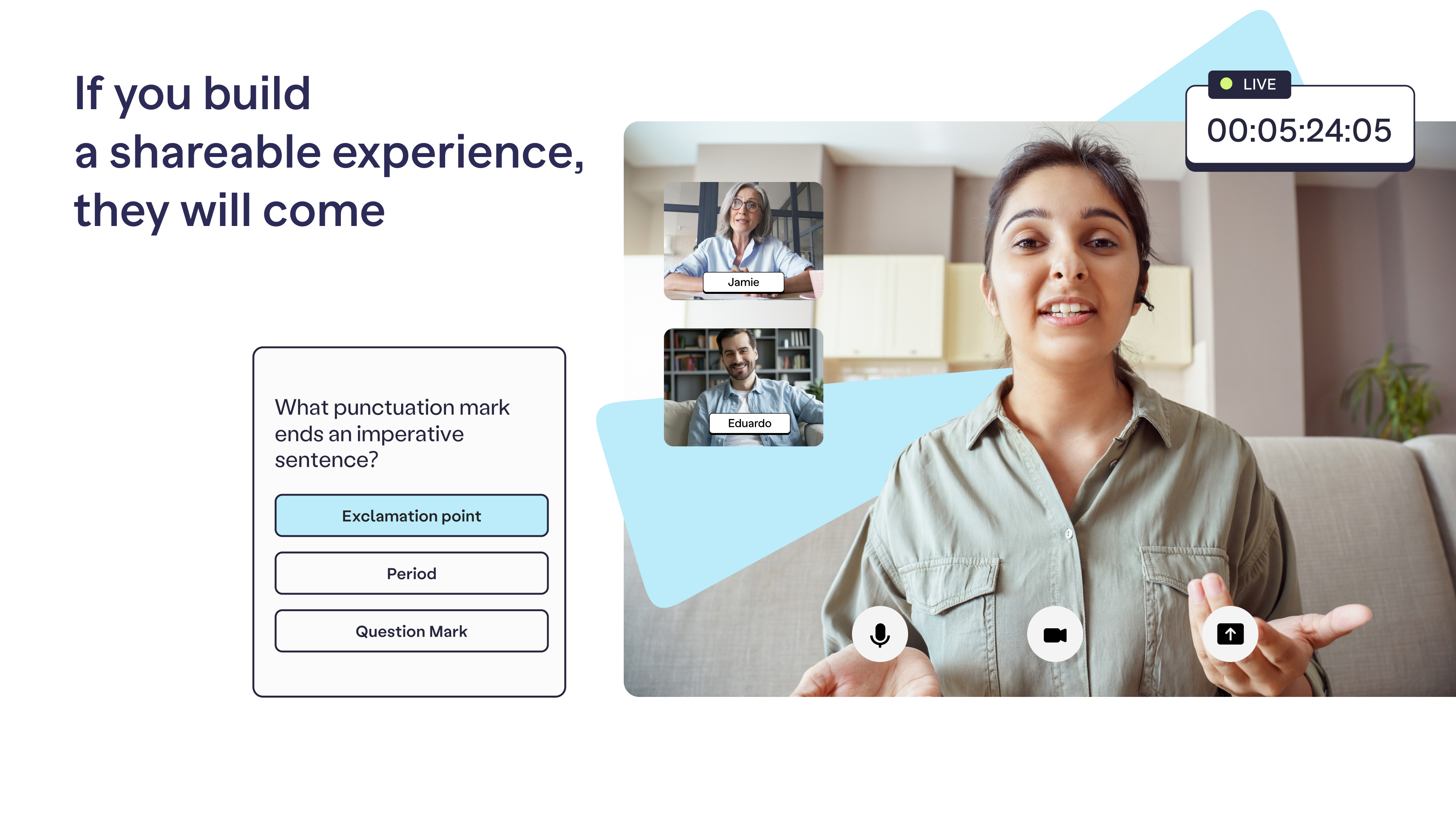
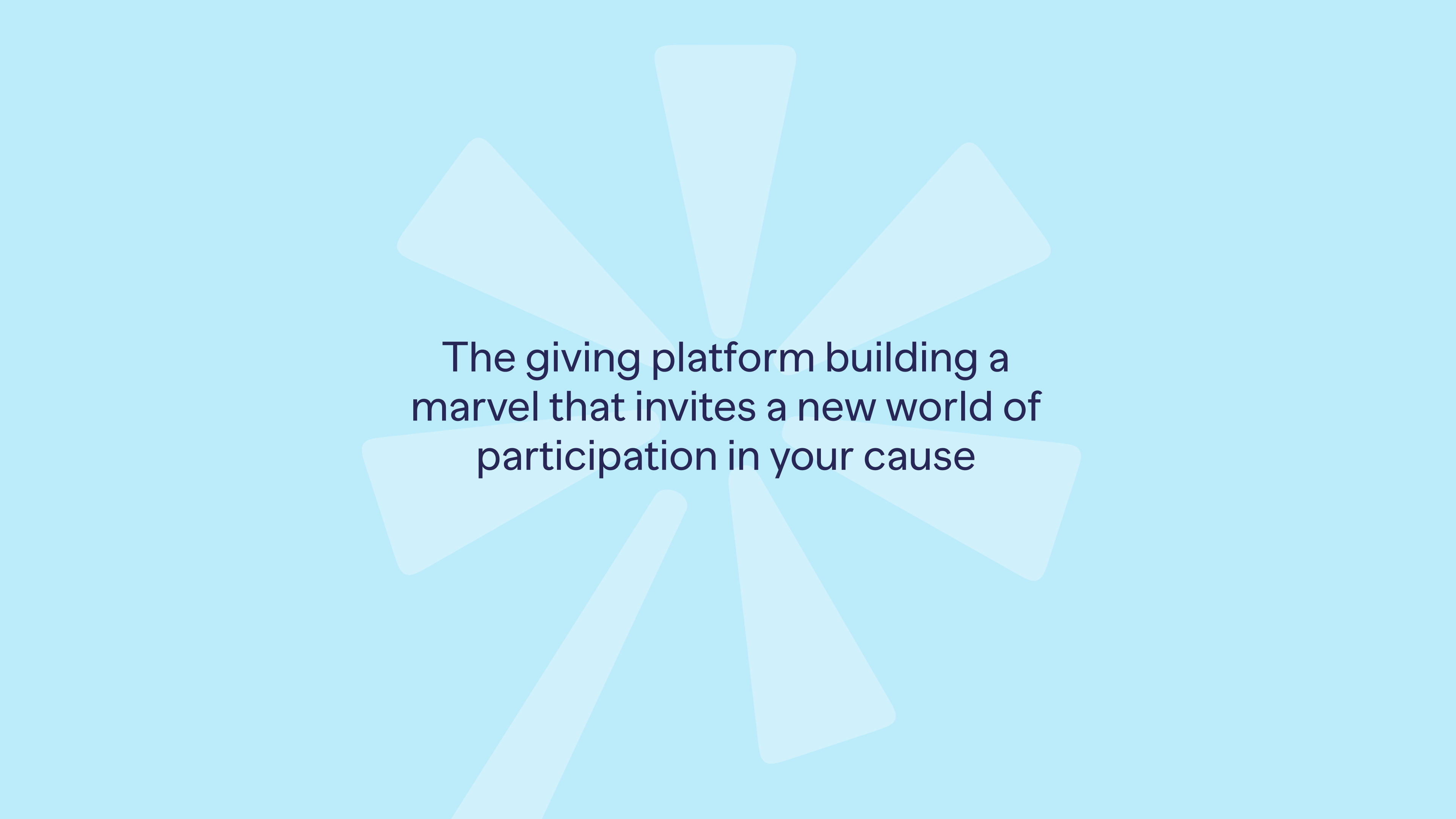
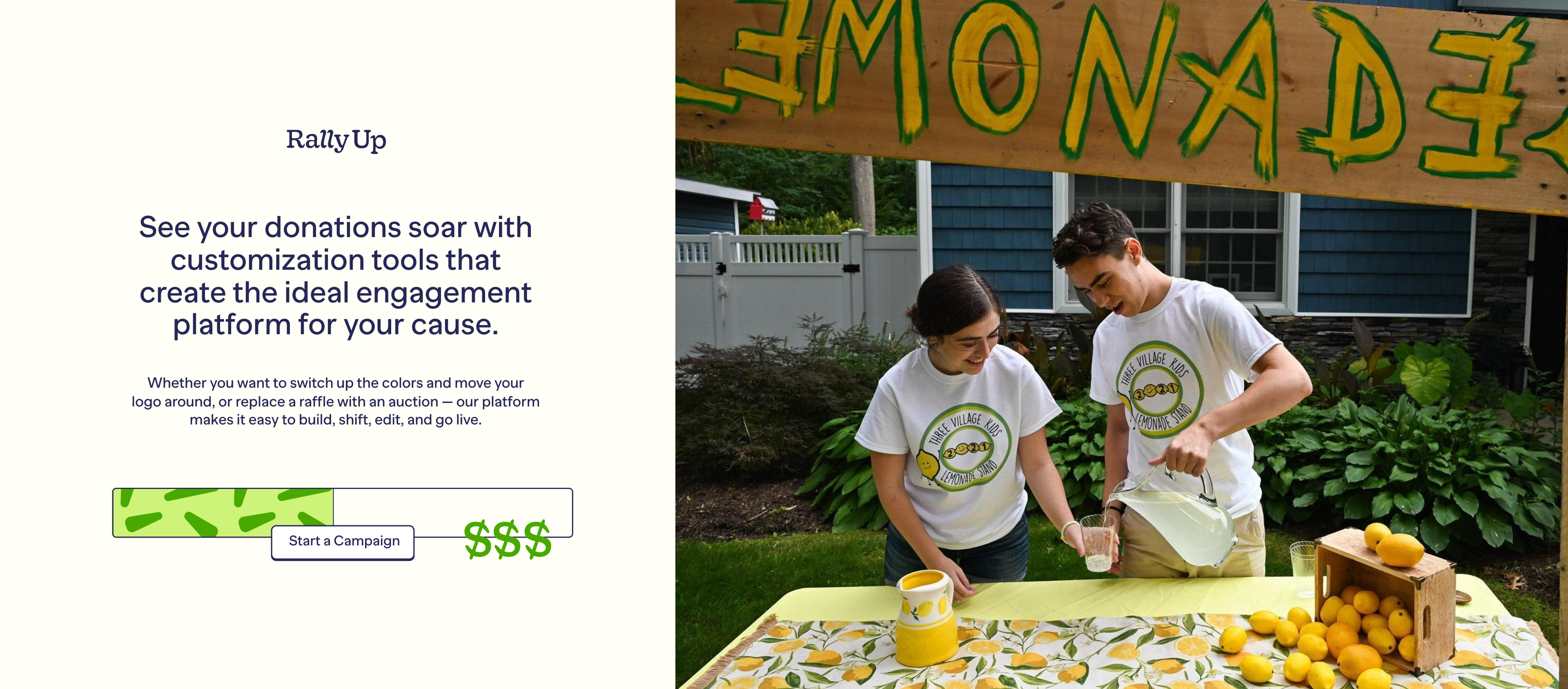
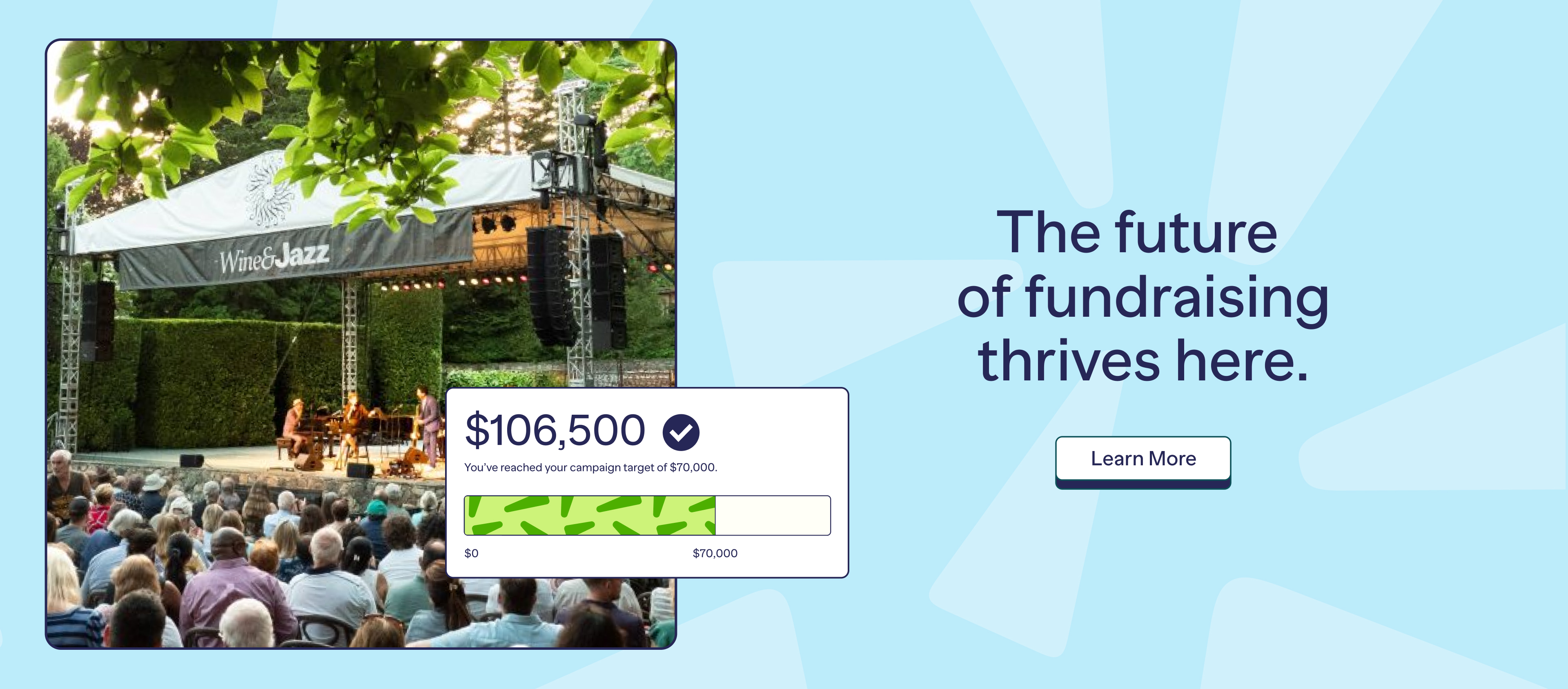
You want to engage an audience with your cause, but the more attention-worthy you try to make an experience—with a special item auctioned, a one-night concert, or a local sale—the fewer people might be able to take part. In trying to draw people in, you actually close so many more out. RallyUp is the giving platform building a marvel that invites a new world of participation in your cause
Deliverables
— Brand Strategy
— Brand Identity
— Brand Guidelines
— Website Design
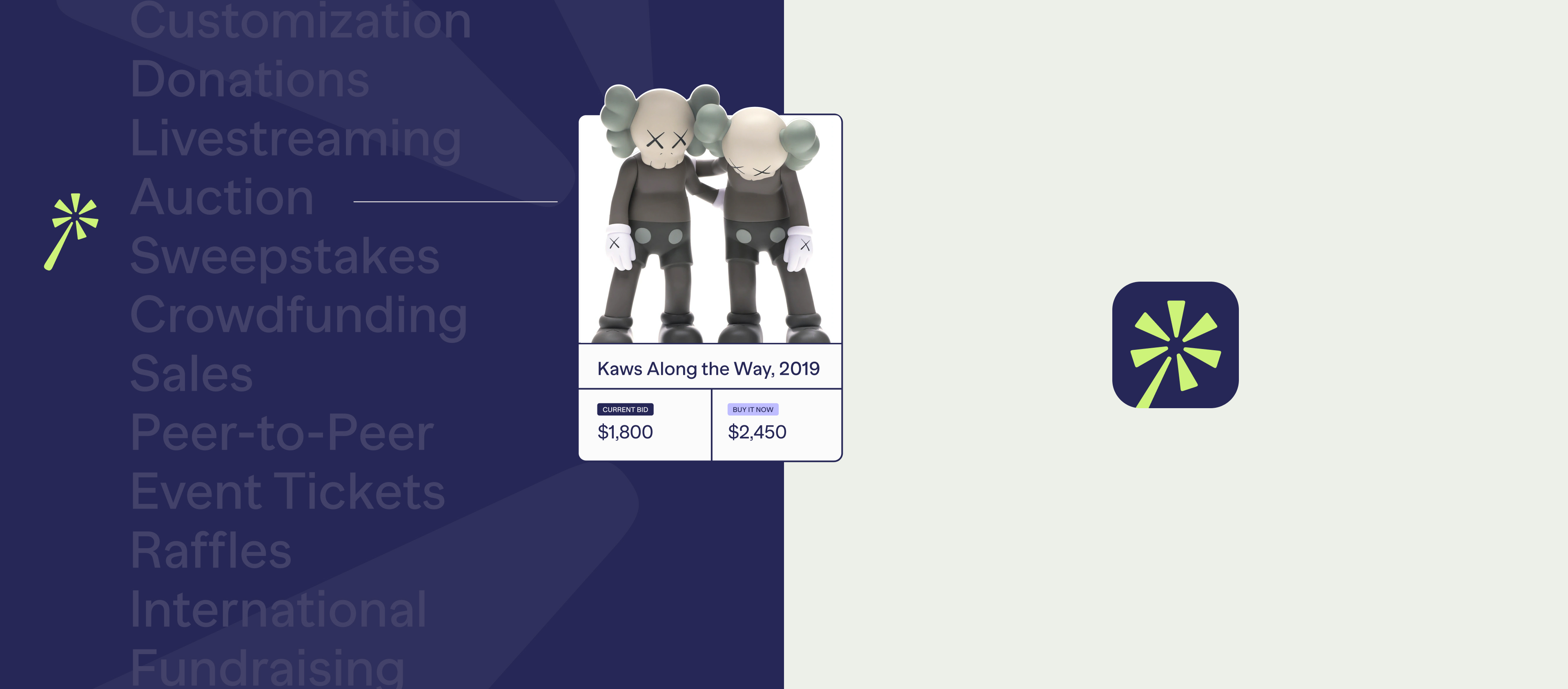
Symbol & Device
Our symbol captures a feeling of marvel that is essential to our platform as it communicates the magical aspect of being able to accomplish a range of experiences through the platform.
We use the spark shape from our wand symbol as a graphic element
that shows all experiences.
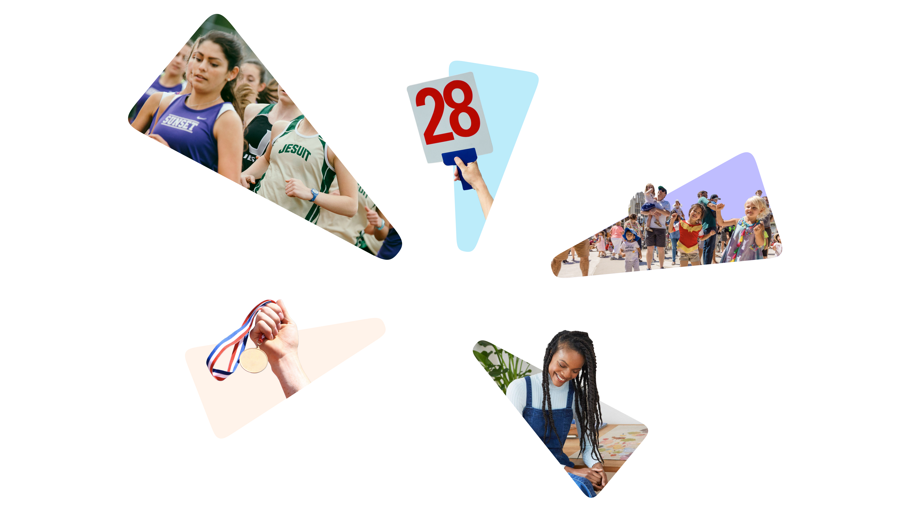
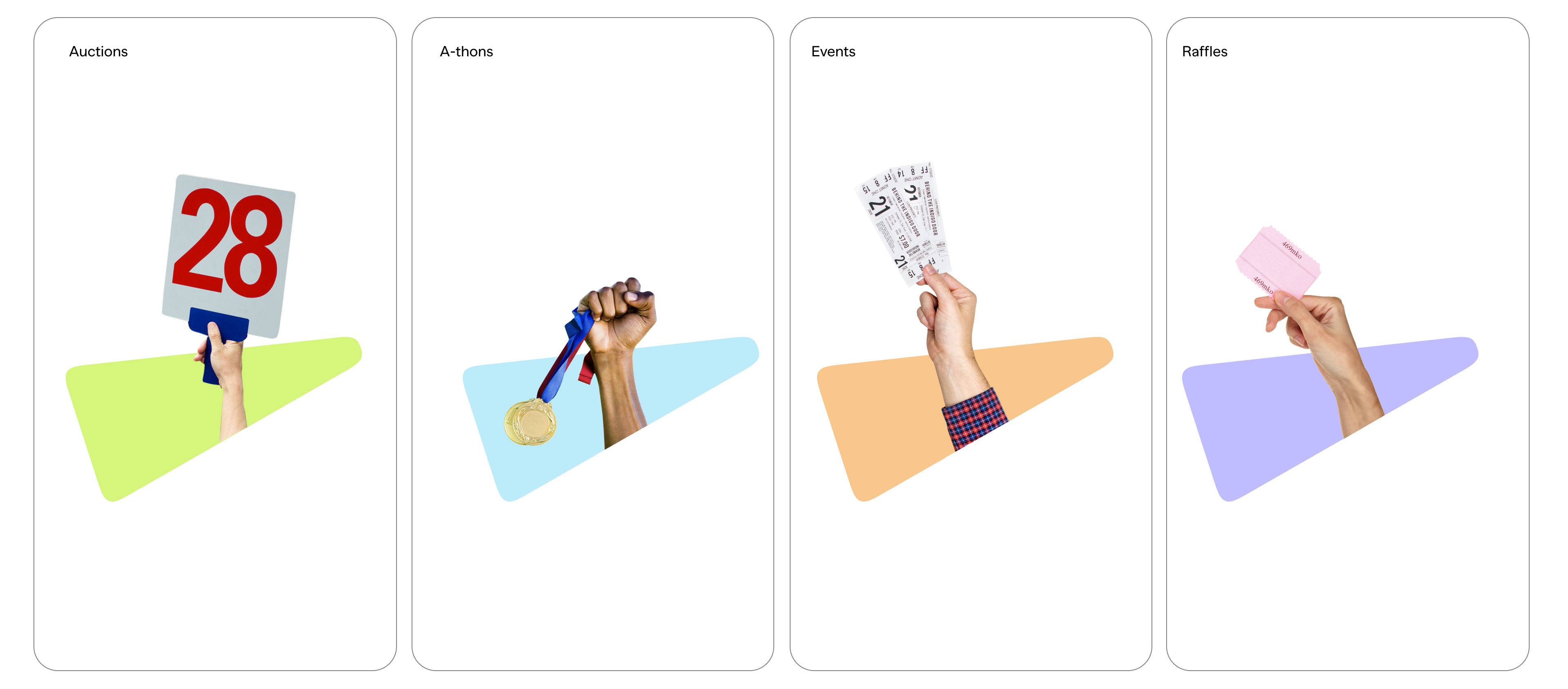
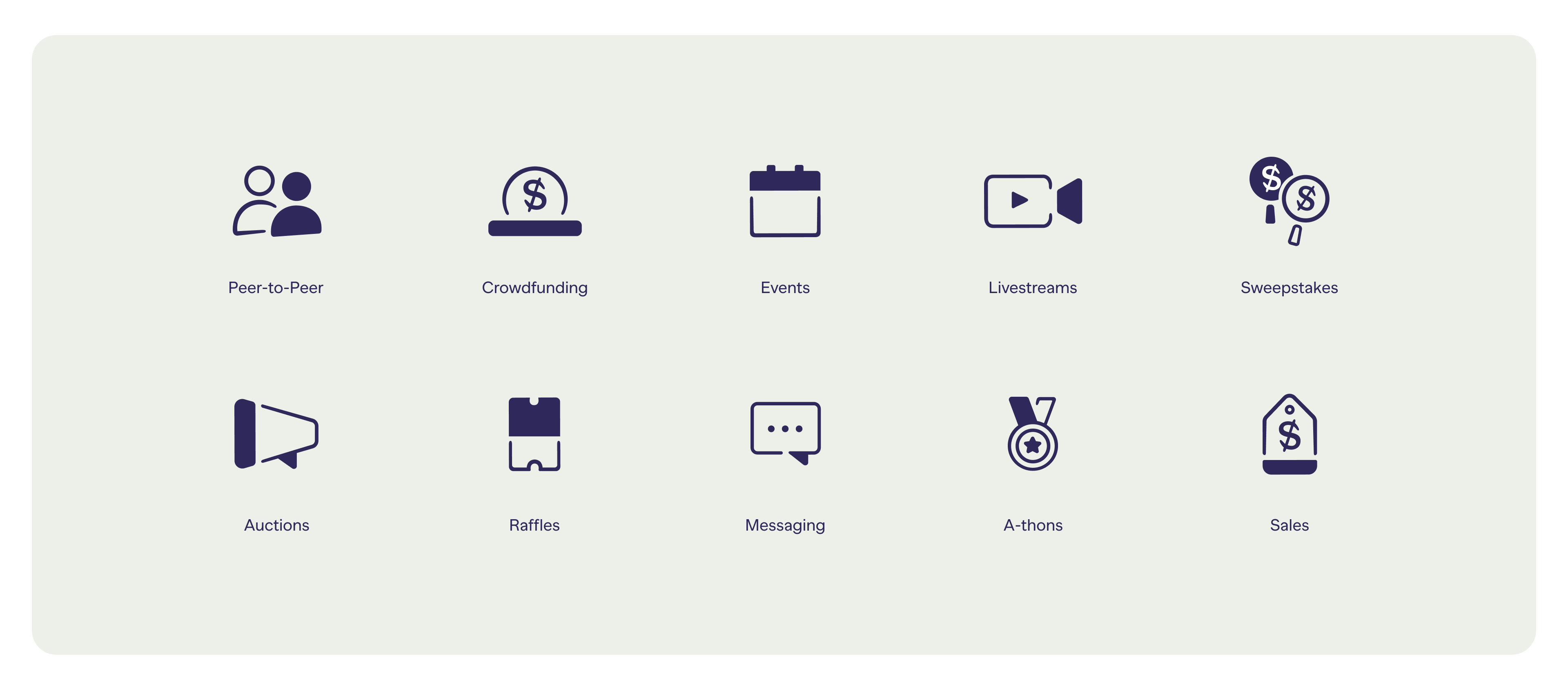
Our icons are uniquely crafted to mimic the details in our wordmark. We combine solid shapes with outlines that speak to the dual relationship between our platform and our users.


Credits:
Client:
RallyUp
Agency:
Red Antler
Executive Creative Director:
Erin Collis
Creative Directors:
Franco Castillo
Designers:
Jenn Flores, Hilda Wong, Mia Watson